A Neuroaesthetic Analysis of High-End Brand Experience
I have terminated contracts with clients who asked me to use my skills to exploit their users for short-term gain. Integrity is not a luxury; it is a necessity. Darkness breeds darkness – we should be the light. So be careful abut the following information. Use them wisely.
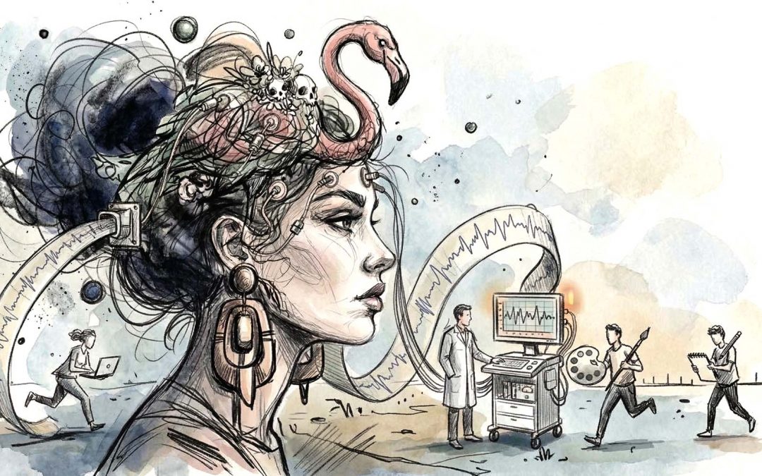
If art speaks to the soul, neuroaesthetics speaks to the hardware. As a Creative Director focused on “Brands with Depth,” I view design as the management of cognitive load. Aesthetics is not a subjective preference. It is a neurological lubricant. When we say an interface is “clear,” we are actually saying it is optimized for the human visual cortex.
To build products for the likes of Porsche, Rolex, or Rimowa, one must understand that beauty is a reward system for efficient processing. Here is the clinical depth behind why we perceive “pixel-perfect” design as superior.
The Six Cognitive Pillars of Aesthetic Excellence
1. Processing Fluency: The Path of Least Resistance
The brain is an energy-saving machine. Processing Fluency is the ease with which a brain processes a stimulus. The more “fluent” a design is, the more the brain likes it – and it misattributes this ease of understanding as “beauty.” High contrast, clear typography, and logical grouping (The Law of Proximity) allow the brain to “read” a brand instantly. This is why I deliver production-ready assets that empower teams. I am removing the friction from their own cognitive process.
2. The Peak Shift Principle Hyper-Reality
This is the most powerful “hack” in neuroaesthetics. The brain responds more intensely to an “exaggerated” version of a stimulus than to the stimulus itself. In luxury design, we identify the “core essence” – the specific curve of a Rimowa groove or the tactile weight of a Glashütte crown – and we emphasize it. By distilling a brand to its “Strategic Depth,” we create a super-stimulus that feels “more real than reality.” Because the brain reacts not only to the object itself, but also to its distinguishing features. It “falls in love” with the exaggeration.
3. The Wundt Curve and Optimal Arousal
Human pleasure follows a bell curve (The Wundt Curve). If a design is too simple, it triggers boredom. If it is too complex, it triggers stress. The “Quiet Professional” seeks the peak of this curve. We provide enough sophistication (Analytical Depth) to satisfy the intellect, but enough clarity (Minimalism) to prevent fatigue. This is the “Bach Suite” of design: a complex structure delivered with humble simplicity.
4. Isolation and the Allocation of Attention
The Isolation Principle states that by stripping away non-essential elements (Amor Vacui), the brain can allocate all its neural resources to a single, powerful focal point. This is the “Paul Rand” or “Vignelli” approach. When I help teams regain focus, I am essentially applying the Isolation Principle to their brand strategy. We stop doing everything so we can do one thing with “Quiet Authority.”
5. Biological Motion and the “Living” Line
The human brain has a specific region (the STS) dedicated to recognizing biological motion. We are repelled by “dead” geometry. We find beauty in lines that possess “latencies” – curves that suggest the tension of a muscle or the growth of a plant. This is why a Porsche 911 feels “alive” even when standing still. It mimics the parabolic curves found in nature, triggering a sense of vitality.
6. The “Aha!” of Perceptual Grouping
The brain loves to solve puzzles. When we perceive individual parts (pixels, icons, copy) and suddenly see them as one “Coherent Direction,” the brain releases a burst of dopamine. This is the “Gestalt” moment. A brand that provides this sense of “oneness” feels profoundly beautiful because it has helped the brain achieve a state of order out of chaos.

The Advanced Neuro-Mechanics of Excellence
The Kanizsa Geometry (The Power of the Implicit)
The brain is wired to “close” shapes. When we leave a form incomplete, the user’s brain must actively work to finish it. This creates a state of active participation.
The Bouba/Kiki Congruence (Synesthetic Branding)
Humans universally associate certain sounds with certain shapes (e.g., “Bouba” is round, “Kiki” is jagged). This is cross-modal mapping.
Affordance Priming (The “Invisible Hand”)
Mirror neurons fire not only when we move, but when we see something that suggests movement. A handle on a Rimowa suitcase “primes” our brain to grip it before we even touch
Anthropomorphic Projection (Pareidolia in Detail)
Our brains are hyper-sensitive to faces. We see “eyes” in the headlights of a Porsche and a “smile” in the grill. This creates an immediate emotional bond.
The Von Restorff Effect (The Strategic Anomaly)
While we love order, the brain is programmed to remember the outlier. One “broken” element in a sea of perfect repetition will be the only thing the user remembers.
Chromostereopsis (Psychological Depth through Color)
Different colors have different wavelengths, causing them to focus on different parts of the retina. Red appears to move forward; blue appears to recede.
Serial Position Architecture (The Primacy/Recency Gaze)
The brain remembers the first and last items in a sequence best, while the middle often blurs.
The “Isolation of Motion” (Vitality Cues)
Subtle, high-frequency movements (like the ticking of a Rolex or a micro-interaction in a high-end app) signal that the system is “alive” and “ready.”

The Ethical Imperative: Design as a Service to the Human Brain
The mastery of neuroaesthetic mechanics brings with it a profound responsibility. In an era where digital products often weaponize psychology to create addiction and “doom-scrolling” loops, the role of the designer must shift from manipulator to steward.
The insights detailed in this architecture of perception – from the Kanizsa geometry to the Von Restorff effect – are not tools for seduction. They are not intended to hijack the dopaminergic system or to obscure intent behind “dark patterns.” On the contrary: we employ these principles to achieve the exact opposite.
We design for clarity, not for capture.
By aligning every pixel with the brain’s evolutionary expectations, we reduce cognitive friction. We remove the “noise” that leads to digital fatigue and decision paralysis. When a brand like Leica or Porsche utilizes these neuroaesthetic “hacks,” they are not trying to trap the user. They are showing the user respect. They are providing a “sanctuary of clarity” in a chaotic world.
For a brand with depth, beauty is a form of politeness. It is the quiet professional’s way of saying: “I have done the heavy lifting of organization so that you don’t have to.”
When we use neuroaesthetics to create a “clear interface” and a “coherent direction,” we are not building a cage. We are building a tool that feels like an extension of the self. This is the true meaning of User Experience: an environment where the technology recedes, and the human intent flourishes.
Brands with depth demand more than decoration – they demand an ethical commitment to the human spirit.

 says hello")
Let's create something meaningful together
I love what I do - for me, design is less of a job and more of a calling. That's why I enjoy working with ambitious individuals and mid-sized businesses just as much as I do with global players. If you bring that same passion to your project, I’d love to hear from you. Let’s find out together how we can take your vision to the next level.


