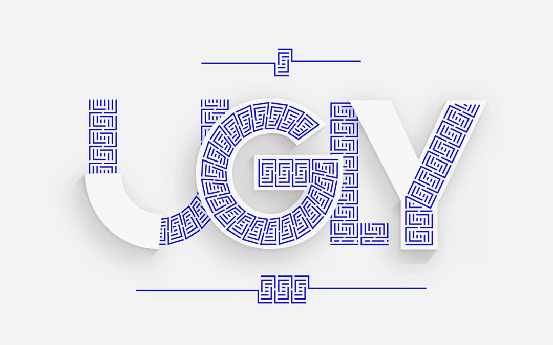
In the contemporary landscape of brand and product experience, we have reached a dangerous inflection point. We are drowning in a sea of “functional” minimalism that has stripped away the soul in favor of the spreadsheet. As a designer who steps in when teams lose clarity, I often see the same symptom: a drift toward the sterile. We have confused “simplicity” with “emptiness.”
Why is beauty important in today’s design?
Because beauty is the ultimate signal of integrity. It is the visible proof that a brand has a “why” behind its “what.” When strategy and execution are in perfect symbiosis, the result is an aesthetic experience that demands respect. Like a Bach Cello Suite, it feels inevitable – as if every note, every pixel, could not exist in any other way. Beauty is not an ornament we add at the end. It is a fundamental requirement for a brand to have depth.
The Sagmeisterian Mandate: The End of “Default” Modernism
Stefan Sagmeister’s crusade against the “ugliness” of modern functionality is a call to arms for the quiet professional. He argues that the mid-20th-century obsession with “Form follows Function” was a wrong turn. If a building or a digital product is functional but makes the user feel depressed, it has failed its primary function: to serve the human spirit.
The Thesis
There are visual stimuli deeply rooted in our biology and evolutionary history. When 90% of people perceive something as “beautiful,” it is usually because our brains are programmed to interpret those stimuli as safe, healthy, or useful.
So, what are these universal “90% truths” that we perceive as beauty?

1. The Biological Safety of the Curve
One of the most profound truths is our instinctive preference for rounded corners. Sharp angles trigger the amygdala – the brain’s fear center. In nature, sharp objects (claws, thorns, jagged rocks) represent a threat. By choosing the “pixel-perfect” curve, we aren’t just being “soft”; we are creating an environment of psychological safety. This is why brands like Polestar or VanMoof resonate; their forms are an invitation, not a confrontation.

2. The Human Imprint and the Value of Effort
We find beauty in the evidence of human devotion – the “handmade” effect. When we look at a Leica camera or a Faber-Castell pencil, we don’t just see an object; we see the thousands of hours of strategic depth and craftsmanship behind it. We find things beautiful when we can sense the Mühe (the dedicated effort). In an era of AI-generated noise, the “Quiet Authority” of a hand-aligned brand strategy becomes a rare luxury.

3. Fractal Balance: Complexity without Chaos
Our brains dislike both extreme chaos and extreme monotony. We crave the complexity found in nature: fractals. These are patterns that repeat across different scales (like ferns, clouds, or coastlines).
The human brain relaxes at a medium information density (roughly 40% redundancy). A blank concrete wall is boring; a completely “noisy” image is stressful. Fractals hit the sweet spot. A brand with depth, like Hermès, understands this; they use patterns and textures that mimic natural complexity, providing the eye with enough “food” to stay engaged without being overwhelmed.

4. Symmetry as a Proxy for Health
For the vast majority of humans, symmetry equals beauty. Evolutionarily, asymmetry in a potential mate or a piece of fruit signaled disease or decay. In design, symmetry (or its sophisticated sibling, dynamic balance) signals a Brand with Depth. When I align a product’s strategy with its execution, I am seeking that symmetrical coherence. It tells the user: “This organization is healthy. This product is stable. You can trust us.”

5. The Color Blue and Natural Gradations
Worldwide, blue is the favorite color of most people. From an evolutionary psychology perspective, this makes perfect sense: a bright blue sky signals good weather and safety; clear blue water signals survival.

6. The “Prospect-Refuge” Theory
When people across the globe are asked to draw a beautiful landscape, they often produce similar scenes:
• An open field (Prospect / View).
• A forest edge or a small hut (Refuge / Shelter).
• Proximity to water.
• Green vegetation.
This is the “Savanna Principle”: we find places beautiful where we can see threats from a distance while remaining hidden and close to resources.

7. Lustre and Light Reflection
Why do we find gemstones, polished cars, or glossy surfaces beautiful? One theory suggests our brains are hardwired to seek the “glimmer” of water. We associate lustre with freshness, purity, and life-sustaining hydration.

8. The Golden Ratio and Proportions
While the math is often mystified, humans consistently prefer proportions close to the ratio of 1 : 1.618. These ratios appear everywhere in nature—from the arrangement of leaves to the chambers of a nautilus shell—and the human eye perceives them as inherently “right.”

9. Visual Rhythm
Much like in music, our eyes love rhythm. When elements repeat in a specific cadence (columns, rows of windows, patterns in fabric), it provides a structure the brain can easily process. The key is balance: if the rhythm is too simple (like a metronome), it becomes boring. If it is slightly varied (like a jazz rhythm), we perceive it as beautiful and alive.

10. Biophilia: The Love of the Living
Humans have an innate affinity for anything that looks like “life.” This manifests in two ways:
• Natural Materials: We almost always find wood, stone, or wool more beautiful and “honest” than plastic or cold steel. This is due to the texture and subtle irregularities.
• Presence of Plants: A room with greenery is almost universally rated as more attractive than an identical room without it.
Why does this matter?
Sagmeister criticizes modern architects and designers for ignoring these universal preferences in favor of “functional” boxes made of glass and concrete. He calls this visual pollution because these environments measurably increase our stress levels and decrease our well-being.
“Beauty is a function. An environment that we perceive as beautiful improves our mood and our behavior.”
– Stefan Sagmeister
If you’re looking to bridge the gap between strategic clarity and aesthetic integrity, I’d love to help you find the soul of your substance. Just let me know by dropping a line.

 says hello")
Let's create something meaningful together
I love what I do - for me, design is less of a job and more of a calling. That's why I enjoy working with ambitious individuals and mid-sized businesses just as much as I do with global players. If you bring that same passion to your project, I’d love to hear from you. Let’s find out together how we can take your vision to the next level.


