Why Brands with Depth Rely on Ancient Archetypes
In the modern rush for “clean” design and “functional” minimalism, we have reached a dangerous point where logos are often reduced to mere geometric exercises. But for a brand to possess true depth, it must tap into a language far older than typography or digital pixels.
According to Udo Becker’s Lexikon der Symbole, a symbol is not merely a sign. While a sign points to a functional reality (like a “P” for parking), a symbol serves as a bridge between the visible world and the invisible realm of human meaning. For a Creative Director, understanding symbolism is the difference between creating a graphic and creating an icon. When we align strategy with these ancient archetypes, we are anchoring a brand in the collective unconscious.


The Symbol as an Energy Carrier
Becker defines the symbol as a “coincidence of opposites” (coincidentia oppositorum). It packs immense emotional energy into a single form. In logo design, this is the “Force Multiplier.” A well-chosen symbol allows a brand to communicate heritage, precision, and stability without a single word of copy. The symbol acts as a psychological shortcut, triggering a pre-programmed response in the human mind.
The Geometric Trinity: Prototypical Forms
Becker’s work places great emphasis on the “Prototypical Forms”—the building blocks of every pixel-perfect brand:
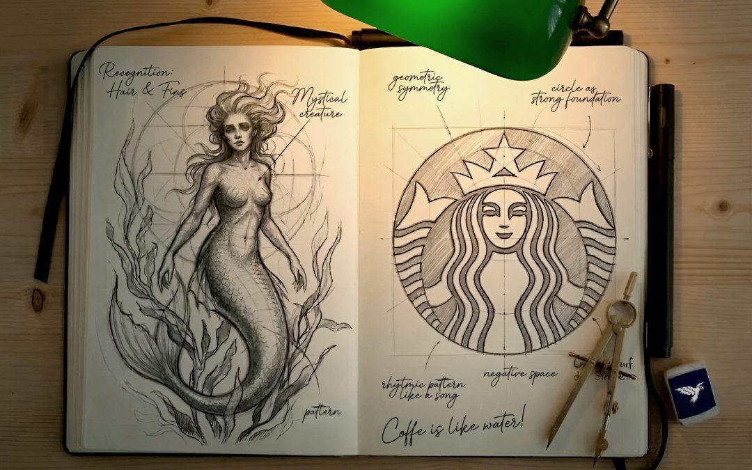
• The Circle (The Monad):
Represents the infinite, the sun, and the self. It is a symbol of totality and protection. It is the “Quiet Authority” of shapes – no beginning, no end.
• The Triangle (The Delta):
A symbol of direction, fire, and the divine. A triangle pointing up is an active, phallic symbol of growth. Pointing down, it becomes a chalice – a symbol of the feminine, grace, and receiving.
• The Square (The Quaternary):
Represents the earth, stability, and man-made order. In the Lexikon der Symbole, the square represents architectural integrity – essential for brands that value tradition and structure.
Case Studies: The Hidden Power of Modern Icons
Starbucks: The Siren and the Duality of Attraction
The Starbucks logo features a Melusine or a twin-tailed Siren. According to Becker, the Siren represents the irresistible temptation of the unknown.
The Deep Insight: On an archetypal level, the Siren symbolizes the Duality of Attraction. By using a mythical creature from the depths of the ocean, Starbucks isn’t just selling coffee; they are tapping into the primal human desire for “The Transcendent.” The twin tail (an “open” posture) is an ancient symbol of fertility and welcome, creating a “sanctuary” feeling that counters the chaos of the urban environment.
Coffee represents here the water of live. The pattern seems to hypnotise the viewer like a song of a siren. The negative space makes it modern and mystical at the same time.
Hermès: The Duc-Attelé and the Absent Driver
The Hermès logo is a masterclass in symbolic restraint. It shows a horse, a carriage, and a waiting groom.
The Deep Insight: The most important part of the symbol is what is missing: the driver. In Becker’s view, the horse is a symbol of vital force and spirit. By leaving the driver’s seat empty, the brand issues an invitation. It means: “Hermès provides the tools and the elegance, but you lead the way.” It is a powerful symbol of autonomy and self-determination.
The signature gives the logo an elegant and sophisticated look. The typography lends it a modern touch. Hermès doesn’t skimp on small graphic details, even though these are barely visible in small formats (website and mobile). But they’re there. Perhaps that makes a difference.

Rolex: The Five-Pointed Coronet and the Human Hand
Rolex utilizes one of the most powerful symbols in human history: the crown.
The Deep Insight: According to Becker, the crown is an extension of the head, symbolizing an opening to the divine or the highest state of perfection. The five points of the Rolex coronet can be interpreted as the five fingers of a human hand – the ultimate symbol of manual craft and mastery. It tells the user: “You have reached the summit of achievement.”
Faber-Castell: The Knights and the “Miles Christianus”
The image of two knights in a tournament is deeply rooted in the concept of honor.
The Deep Insight: The knight is the symbol of the “Miles Christianus” – the warrior for truth, honor, and resilience. For Faber-Castell, this is an archegetic representation of quality. It suggests that their materials (the pencil lead) will not break in the “heat of battle.” It is a symbol of durability and the noble pursuit of creation.
Apple: The Bite and the Byte of Knowledge
The Apple logo is perhaps the most discussed symbol of the modern age. It takes up the oldest story of humankind: the fall of Adam and Eve in the Garden of Eden. But also the discovery of gravity by Isaac Newton, who (according to legend) had an apple fall on his head.
The Deep Insight: In the Lexikon der Symbole, the apple represents life, love, and fertility, but also the forbidden fruit of Knowledge. The “bite” (byte) makes the symbol human. It represents curiosity and the courage to break the rules. Without the bite, it would be a perfect but lifeless fruit; with it, it becomes a symbol of the intellectual Fall – and the subsequent rise through technology.
Mercedes-Benz: The Celestial Trinity
The three-pointed star is a symbol of universal dominance.
The Deep Insight: A star is a heavenly sign, representing guidance and hope. Becker notes that the number three represents the Trinity. For Mercedes, this symbolizes mastery over the three elements: Land, Sea, and Air. It is a symbol of a total claim to excellence across the entire physical world.
Shell: The Pecten and the Pilgrimage of Energy
The seashell (Pecten) is a symbol often associated with Saint James (the Santiago de Compostela pilgrimage).
The Deep Insight: The shell is a symbol of the womb, protection, and Rebirth. For an energy company, this is a profound irony: it represents the journey, the movement of the traveler, and the constant renewal of energy. It transforms a fossil fuel company into a symbol of life’s ongoing journey.
Color as Symbolic Language
Color is never just an “aesthetic” choice. It is a frequency of meaning.
• Gold/Yellow:
The symbol of the spirit and the sun. In high-end branding, it is not just about wealth; it is about “The Crown”—the attainment of the highest possible state of craftsmanship.
• Blue:
The symbol of the “Great Mother” and the celestial void. It represents depth, calm, and distance. It is the color of strategy and Analytical Depth. Neuroscience has confirmed that blue light lowers blood pressure.

Why Symbols Demand Integrity: The Symbolic Lie
A symbol is a promise. If a brand uses a symbol of “Stability” (like an anchor or a mountain) but operates with a chaotic, short-term strategy, the human brain detects the “Symbolic Lie.” This creates the cognitive dissonance I often encounter when teams lose clarity.
My role as a Creative Director is to ensure that the symbol is not just “decoration,” but a truthful reflection of the brand’s internal character. We use symbolism to name the essence of the brand and expose its truth to the world.
Conclusion: Designing for the Soul
As designers, we are the modern keepers of these ancient keys. When we use a symbol, we are calling upon thousands of years of human history. By applying the insights from Udo Becker’s Lexikon der Symbole, we ensure that our designs don’t just “look good” on a screen – they resonate in the collective unconscious of the user.
Beauty is a form of politeness, but symbolism is the understanding of the past and energy.

 says hello")
International Freelance Creative Director & Digital Product Designer
Let's create something meaningful together
I love what I do - for me, design is less of a job and more of a calling. That's why I enjoy working with ambitious individuals and mid-sized businesses just as much as I do with global players. If you bring that same passion to your project, I’d love to hear from you. Let’s find out together how we can take your vision to the next level.


