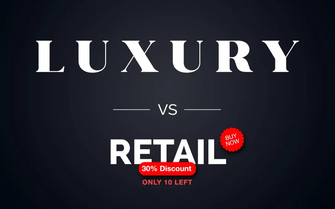
The Dangerous Dead End of Insignificance in App/Web Design
There is a territory in design where brands lose their identity. It lies exactly between the sublime silence of a luxury brand and the hyper-efficient volume of a retailer. Those who land here are confronted with the strategic challenge of the “undefined middle.” The interface is too restless to evoke desire, yet too cluttered or vague to sell quickly.
In my work, I often encounter the “Data Paradox”: Analysts demand more content in the first viewport to increase click-through rates. Designers demand white space to protect the brand. The result is often a lazy compromise that, unfortunately, disappoints both worlds.
The Design Scale: From “Loud” to “Silent”
Every interface communicates on an acoustic-visual scale between transactional noise and sovereign silence. While the mass market (Retailers like Temu, Wish, Kik, Amazon, etc.) relies on maximum volume and crammed viewports to force quick clicks through visual stimuli, masstige and premium brands like Nike or Apple find a balance between lifestyle aesthetics and efficient sales logic. They utilize the “Aesthetic Grid” to organize complexity.
At the end of this spectrum stands ultra-luxury: here, “Silent Design” reigns. Brands like Porsche or Leica withdraw from the digital shouting match through radical reduction. They rely on “Slow Design,” where white space is not seen as emptiness, but as a signal of excellence and a status of effortlessness. Design here is the conscious decision regarding the strategic volume of a brand.
Information Density and the “Missing Layer” in App Design
While we can rely on the “hover effect” on the web to elegantly hide information and only reveal it when needed, app design lacks this layer of interaction. On a smartphone, there is no cursor gliding over elements. This forces an even tougher decision:
• The Retail Solution: Everything must be immediately visible. This carries the risk of a cluttered interface that visually suffocates the user.
• The Luxury Solution: We give the elements room to breathe and use Progressive Disclosure (step-by-step revelation) via scrolling or targeted taps. We trust that the quality of the first impression is high enough that the user will take on the “effort” of the next step.
What Science Says: Two Crucial Studies
To bridge the gap between gut feeling and data, it’s worth looking at the research:
1. The Aesthetic-Usability Effect (Kurosu & Kashimura, 1995):
In their groundbreaking study, researchers found that users perceive aesthetically pleasing interfaces as more functional and easier to use—even if they are objectively no more efficient. For luxury brands, this means an “empty” viewport with plenty of white space is not an obstacle, but a credit of trust. Aesthetics mask cognitive effort.
2. Google Study on Visual Complexity (Tuch et al., 2012):
Google investigated how quickly users judge the beauty of a website (within 17 to 50 milliseconds). The result: websites with low visual complexity (i.e., lots of white space and clear structures) were consistently rated as more beautiful and trustworthy. Too much content in the first viewport is neurologically classified as “noise” and immediately lowers brand perception.
The Trap: The “No Man’s Land” of Brand Management
When a brand tries to cross the conversion rate of a cheap toothbrush on Amazon with the aura of a Porsche 911, something psychologically fatal happens:
1. Loss of Pricing Power: Shouting in the first viewport signals neediness. Neediness is the natural enemy of luxury.
2. Cognitive Overload: Leaving too much white space without laying a clear “scent” (Wayfinding) leaves the user stranded. They bounce – not out of disinterest, but out of disorientation.
Should a Retailer Look High-End?
Not necessarily. Their psychology: Every pixel must scream “savings.” Beauty is almost viewed with suspicion here—a design that is too beautiful could signal to the customer: “This product is expensive because the marketing costs so much.” The message: “We don’t have time for design; we’d rather pass the discount on to you.” It’s a strategy that works.
“The Halo Strategy” or “Premium Retail”:
The retailer uses the visual codes of luxury (white space, high-quality typography, material honesty) to create a “Value-Experience-Gap.” The customer pays a moderate price but feels like a guest in an exclusive world.
Three prime examples of retailers that have won through “high-end aesthetics” are Apple, Aesop, and COS. High-end aesthetics in retail act as a Trust Accelerator. When a retailer appears high-quality, it reduces cognitive resistance during the purchase. The user thinks: “If they put this much care into the design, the product/service must be excellent as well.”
A retailer only fails with this approach if the promise of the design is broken by the experience of the product. If the shop looks like a gallery (Luxury) but the customer service acts like a budget discounter (Retail-Loud), a massive cognitive dissonance arises. The brand then feels “fake.”
The Insight: “Cheap” brands use design to overwhelm the user. Luxury brands use design to empower the user.


The “Sweet Spot”: Order is Not Decoration
When we structure the first viewport in app design well without stuffing it, we use mathematical grids. Order conveys quality. When every element follows a logic, the brain perceives even a higher information density as “tidy.”
The fewer elements we use, the more thoughtful they must be to unfold their full effect and achieve the desired impact.
The Exception: When Rules Become Shackles
Despite all studies and neuro-aesthetic principles, there is one important truth: there are no universal rules.
Design is not an assembly line process. There are moments when a conscious break of the rules is the only way to generate attention or impact.
• Brutalist Design breaks every rule of proportion to express rebellion.
• High-End Editions can be intentionally designed to be “complicated” to emphasize exclusive access.
Systematics is the foundation, but intuition is the roof. Knowing a rule means finding the point where you can break it effectively.
Conclusion: Design is the Decision of Direction
A retailer must be loud to survive. A luxury brand must be able to remain silent to shine. Anyone trying to be both at once will become invisible in the digital noise.
Ultimately, we measure success not just by the click-through rate, but by price elasticity. Are you being clicked because you are cheap, or are you being sought out because you are excellent?

 says hello")
International Freelance Creative Director & Digital Product Designer
Let's create something meaningful together
I love what I do - for me, design is less of a job and more of a calling. That's why I enjoy working with ambitious individuals and mid-sized businesses just as much as I do with global players. If you bring that same passion to your project, I’d love to hear from you. Let’s find out together how we can take your vision to the next level.


