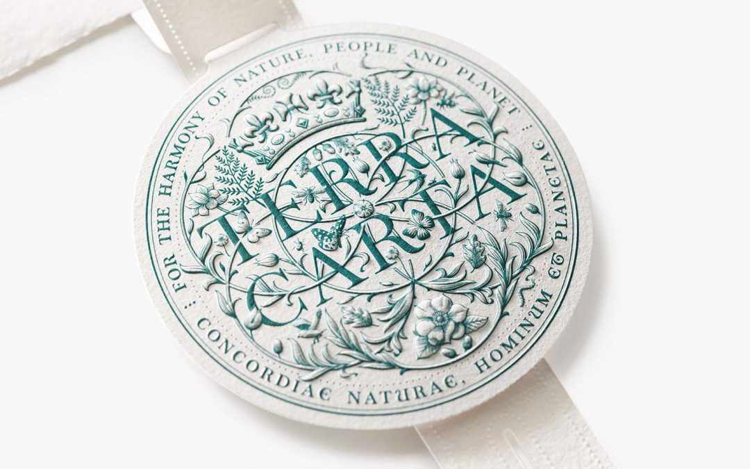
After years of radical reduction at Apple, Jony Ive introduced a markedly different visual language with LoveFrom. Within the framework of the Sustainable Markets Initiative, launched by Charles III, the Terra Carta Seal was created – an award recognizing companies committed to limiting global warming to 1.5°C. At first glance, the seal appears ornamental. Botanical elements. Animals. A dense circular composition. It is tempting to read this as a departure from Ives’ minimalist past. It is not. Minimalism at Apple was functional. Interfaces must disappear to create clarity. A manifesto operates under different conditions.

Structure Within Density
The seal’s visual richness is not decorative excess. It is structured complexity. Its composition follows proportional systems long observed in nature – including principles related to the Golden Ratio and Fibonacci sequencing. Yet these systems are not showcased. They remain invisible. The structure stabilizes the composition without announcing itself. This is not maximalism. It is controlled density. The shift here is important: not reduction for its own sake, but precision in managing complexity.
Heritage as Strategy
The Terra Carta Seal references heraldic tradition and the legacy of the Magna Carta. This is not nostalgia. It is positioning. Sustainability is framed as civilizational responsibility, not trend. Tradition functions as a vehicle of legitimacy. Formally, however, it is reinterpreted with contemporary discipline. Not retro design. Cultural framing.

Physical Depth vs. Digital Surface
A critical aspect lies in the distinction between mediums. The physical seal – produced on sustainable paper with embossing and material depth – creates actual dimensionality. Tactility becomes part of the message. Responsibility is materialized, not merely communicated. In everyday digital use, however, the seal appears predominantly as a static image on websites. Here, there is no haptic layer. The entire complexity must function through line work, proportion and contrast alone. This is where the quality of the design becomes evident: The composition is constructed with such precision that it sustains visual depth even as a flat graphic. At its core, the seal becomes a study in how much information a surface can carry before it loses clarity.

Opulence in the Age of Generative Systems
The Terra Carta Seal was created in 2021 – before generative image AI became widely accessible in the design mainstream. Its density is not the byproduct of algorithmic variation. It is the result of deliberate composition.
Today, when complex imagery can be generated in seconds, ornament alone holds little value. What remains valuable is judgment. Why does each element exist? What role does it play within the system? Where is restraint applied? Design shifts from production to curation. The Terra Carta Seal demonstrates that complexity is legitimate – if it is structurally controlled and conceptually grounded. Opulence becomes credible only when it carries intention.

Conclusion
The new opulence is not a rejection of clarity. It is clarity under different constraints. For years, reduction signaled control. Today, controlled complexity can communicate the same authority. Style is secondary. Coherence between intent, context and execution is decisive. This is where strategic brand and product experience begins. As brands grow, they tend to fragment. The Terra Carta Seal is a reminder that complexity only works when it is held together by structure.

 says hello")
Let's create something meaningful together
I love what I do - for me, design is less of a job and more of a calling. That's why I enjoy working with ambitious individuals and mid-sized businesses just as much as I do with global players. If you bring that same passion to your project, I’d love to hear from you. Let’s find out together how we can take your vision to the next level.


