
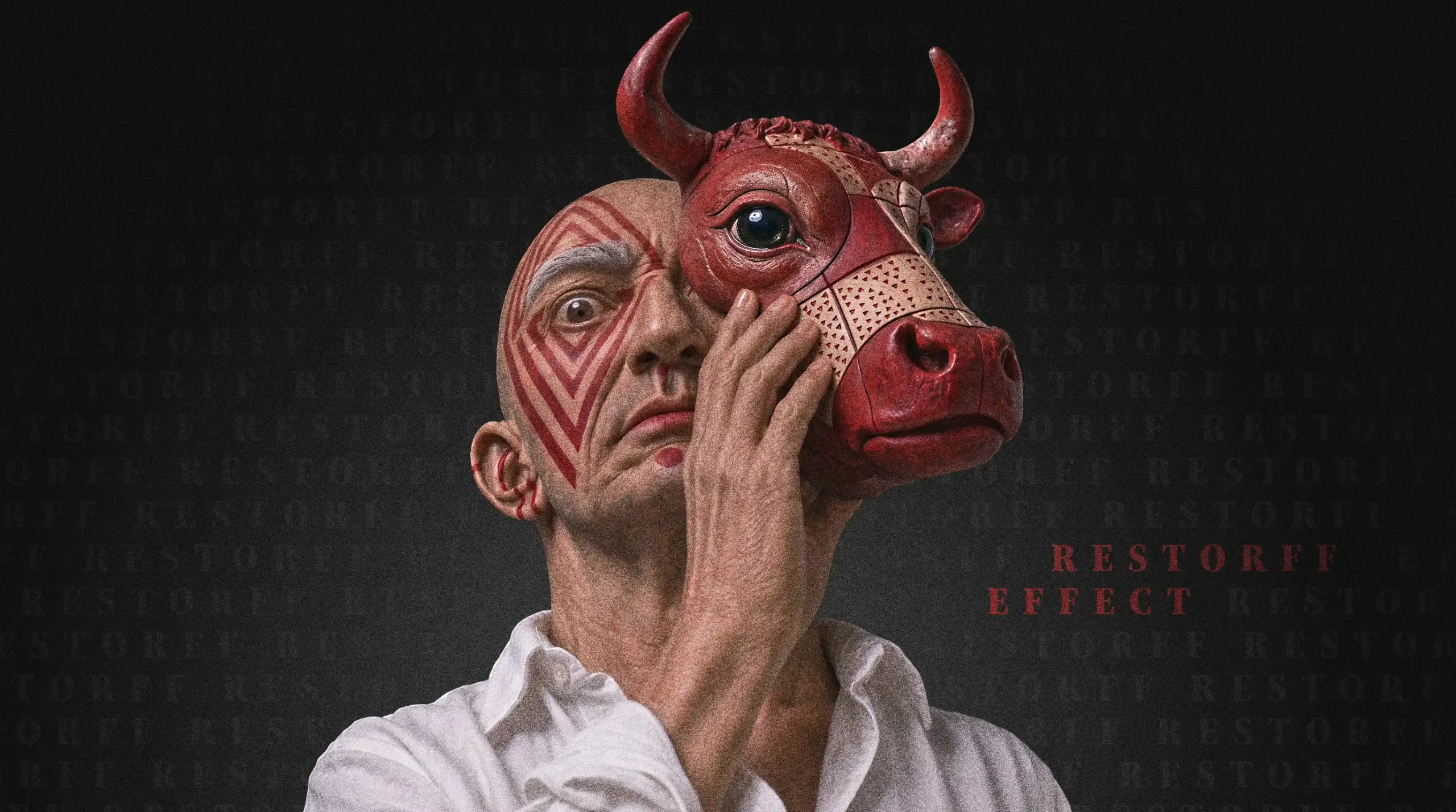
Essay — Branding & Neuroaesthetics
The
Von Restorff
Effect
What happens in the brain when something stands out, how UX design uses it, and why a rebrand without substance destroys trust.
The Sea of Sameness
Why most brands look interchangeable
Clarity became a standard. Then it became a uniform.
Scroll through any digital product category and the pattern is hard to miss. The same interface conventions. The same smoothed-out sans-serif logos. The same predictable color palettes. The B2B SaaS company looks like the fintech start-up. The luxury manufacturer borrows the same visual restraint as the subscription app.
None of this happened by accident. The search for functional clarity, accessibility and scalable systems is legitimate. But added up, it produced a sea of visual indifference.
Against this collective march, designer and educator Chris Do made a pointed argument. His keynote at VidCon 2025 carried the title "Unbland Yourself." His premise: if you do what everyone else does, you are not building a brand. You are practicing what he calls "blanding." The remedy is to lean into what makes you different.
The logic seems sound. Whoever does not stand out is overlooked. Psychology has a name for the mechanism behind it: the Von Restorff effect, also called the isolation effect. It says that an item that differs from its surroundings is more likely to be noticed and remembered.
This essay asks what that effect really demands of a brand. The answer is less comfortable than it sounds. It demands more than a new look.
What Happens in the Brain
The neuroaesthetics of the outlier
The brain is a prediction machine. Where the prediction breaks, attention begins.
1.1 What is the Von Restorff effect?
TheoryIn 1933, the psychologist Hedwig von Restorff published a study that now appears in every textbook on memory. Working in the tradition of Berlin Gestalt psychology, she gave participants lists of similar items, such as syllables or numbers. In each list she placed one item that did not fit, for example a number among syllables.
The result was clear. The odd item was remembered far better than its neighbors.
One detail is often overlooked. The isolated item is not special in itself. The same number, placed in a list of numbers, disappears. Only the contrast with its surroundings makes it visible. Standing out is not a property of an object. It is a relationship between an object and its context.
Two consequences follow. An outlier needs a context calm enough to recognize it as an outlier. And if everything stands out, nothing does.
1.2 What happens in the brain when something stands out?
The brain builds expectations from repetition. It predicts what comes next and saves energy by doing so. A stimulus that violates the expectation creates a prediction error. The system signals: something is wrong here, this is worth the effort.
- Early detection. In the EEG, a component called the mismatch negativity reacts to deviations in a sequence of stimuli within a fraction of a second, before conscious attention sets in.
- Encoding. A little later, the P300 appears. It is linked to attention and to updating the brain's working model of the situation. In classic experiments, Karis, Fabiani and Donchin found that isolated words triggered larger P300 responses, and that those words were recalled more often. The link was strongest in people who memorized by simple repetition.
- Arousal. A deviation triggers an orienting response. The locus coeruleus, a small nucleus in the brainstem, is considered central here. It releases noradrenaline, the pupil widens, and the item is processed more deeply.
- Consolidation. Novelty engages the hippocampus, the gateway to long-term memory. Studies with patients show that damage to the medial temporal lobe and the prefrontal cortex weakens the memory advantage for novel items. Dopamine-related circuits are thought to support the consolidation of what is new.
The details of this interplay are still debated. The basic principle is well supported: the deviation is not just noticed. It is stored more strongly.
1.3 Why does an outlier feel beautiful, or not?
Neuroaesthetics asks what makes perception pleasant. One central answer is processing fluency. Stimuli the brain can process with ease are rated as more beautiful and more trustworthy. Order, symmetry, repetition and clear hierarchy create that fluency.
At the same time, complete uniformity bores. The psychologist Daniel Berlyne described an inverted U-shaped relationship in the 1970s: too little stimulation tires, too much overwhelms, and the most pleasure lies in between. Designer Raymond Loewy put the same insight into a rule of thumb: the most advanced design that is still acceptable.
For the outlier this sets a condition. It reads as an aesthetic gain only when it sits inside a legible system. A clear frame makes the break interpretable. Without a frame, only noise remains.
The Effect in UX Design
Isolation with intent
Every interface is a contest for limited attention. The Von Restorff effect decides who wins it.
2.1 How is the Von Restorff effect used in UX and UI design?
PracticeIn branding, the effect governs recognition. In UX and UI design, it works as a functional backbone for guiding users. Eye-tracking research, including work by the Nielsen Norman Group, shows that people do not read interfaces line by line. They scan for visual anchors. Contrast, scale and white space draw the first fixation. Interface design uses this to simplify complex decisions.
- The primary call to action. Dozens of elements compete on a conversion page. When the main action ("Start now") gets a dominant contrast color, a larger hit area and isolated white space, while secondary actions ("Learn more", "Log in") stay quiet, the choice gets easier. This is consistent with Hick's law: fewer competing options, faster decisions.
- Pricing tables. The preferred plan is scaled up, tinted or marked with a badge. The visual isolation reads as a signal of value and pre-selection. The recommendation has to be honest, otherwise the pattern tips into manipulation.
- Status indicators and micro-interactions. Red notification badges, error states in forms and floating action buttons all rest on the same principle: a controlled interruption of the visual pattern.
- Text hierarchy. One key statement, set apart by size, weight or white space, gets read. Five highlights get skimmed.
2.2 When does the effect backfire?
Overuse breaks the system. When five elements on a dashboard demand dominance at the same time, none of them wins. Attention scatters, the interface feels heavy, and users learn to ignore anything that shouts. This is the logic behind banner blindness.
Three limits apply in every interface:
- One or two isolation points per view. More than that, and the points cancel each other out.
- More than color. Differences need shape, contrast or labels as well, so they work for people with low vision.
- Importance, not noise. Highlight only what matters for the user's goal. Reserve the strongest signals for the rare moments that need them.
The Trap of Difference for Its Own Sake
Loud is not distinct
The effect explains what gets remembered. It says nothing about whether it deserves to be.
3.1 What happens when a brand wants to look different at any cost?
Memory does not judge. A red stain on a white shirt is remembered just as well as a red rose on a white table. The Von Restorff effect measures retention, not affection. It shows that isolation creates attention. It does not show that this attention helps the brand.
Differentiation is not an aesthetic sport. When a brand changes its visual language only to look different from the competition, it uses the effect in the cheapest possible way. Visual eccentricity without a strategic anchor does not create admiration. It creates irritation and disorientation.
Typefaces turn unreadable. Layouts chase short-lived trends. Color palettes read like a cry for help. The result is not brand value but visual noise. The isolation effect then flips: the brand is registered as "different" but filed in memory as unserious, exhausting or unprofessional.
A company that tries to break the frame without a foundation for doing so resembles a conference attendee shouting during a keynote. People look. They do not see an authority.
3.2 Why is a cosmetic rebrand so dangerous?
The most dangerous form of rebranding is the purely cosmetic facelift. It misuses the Von Restorff effect as a distraction.
The pattern is familiar. The product is weakening, customer satisfaction is falling, the business model is under pressure, or the internal culture suffers from bureaucracy. The diagnosis in the executive suite is surprisingly often: "We need a new look. We have to appear fresher, more modern, different."
After months of agency workshops, the new identity is unveiled. The typography is sharp. The imagery is carefully curated. The manifesto sounds like a new beginning. Behind the polished surface, nothing has changed. The processes stay slow. The product has the same flaws. Customer service stays distant. The culture stays where it was.
This creates a strong form of cognitive dissonance in the customer. Visual communication is a promise. A modern, uncompromising design signals innovation, precision and foresight. When the customer then meets a dusty product or a sluggish service, the broken promise hurts twice.
An outdated design on a poor product is tolerated, grudgingly. A brilliant, bold design on a poor product is experienced as deception. The rebrand does not work as a liberation. It works as a Trojan horse that destroys the remaining credibility from within.
The cost does not end there. Recognition builds through repetition over years. A brand that gives it up for an effect without substance pays twice: it loses familiarity and gains no differentiation.
Unblanding with Substance
How real differentiation emerges
Real differentiation is not invented at the drawing board. It is uncovered from substance.
4.1 How can a brand use the Von Restorff effect well?
TheoryIf difference for its own sake fails and a cosmetic facelift evaporates, what remains of Chris Do's call to unbland? The answer lies in an attitude that treats design not as decoration but as the relentless translation of content into form. Do himself frames personal branding as a journey inward, not a conversion tactic. The same holds for companies.
- Isolation demands courage in content. For the effect to last, the visual isolation needs an echo in operational reality. A brand that stands out visually has to take a clear position in performance, attitude or user experience. The visual anchor holds in memory only if the experience behind it meets the expectation.
- Rejecting the bland demands clarity. Before a new brushstroke is set, it has to be clear what the brand stands for and what it decides against. Whoever wants to please everyone ends up in visual porridge. Differentiation requires the courage to exclude. A strong brand attracts the right customers by repelling the wrong ones.
- Form follows stance, not trend. A design system should not copy the current best practices of the tech industry or the visual habits of competitors. It should reflect the inner logic of the product. If a product is radically simple, the design has to make that simplicity felt. If a service stands for uncompromising craft, that weight and precision belong in the typography, the materials and the grid.
4.2 Why does authenticity matter more in the age of AI?
AI tools now generate thousands of polished designs and texts at the push of a button. Craft alone loses its monopoly as a point of difference. Perfection has been democratized. The result is a new layer of digital noise: extremely smooth, technically flawless, emotionally sterile.
Chris Do makes a related point. He expects the future of branding to be more human, because machines already deliver the glossy surface of perfection. The Von Restorff effect no longer works through smoother surfaces or louder effects. To be different today means to allow human edges, honest breaks, devoted craft and a stance that cannot be mistaken for another.
4.3 What should a brand ask before a redesign?
PracticeFour questions help before any visual change.
- Is the difference true? Is it carried by the product, the stance, the behavior? If not, it is a costume.
- Is it relevant? Does it matter to the people who should buy, use or recommend? A true but irrelevant difference is trivia.
- Is it legible? Does it sit in a clear system where the break stays recognizable?
- Is it sustainable? Can the brand live it for years, at every touchpoint? An outlier that exists only at launch is a campaign, not a brand.
Four yes answers mean differentiation. Two no answers mean a coat of paint.
Different Because It Cannot Be Otherwise
The Von Restorff effect describes a mechanism. The brain remembers what breaks the pattern. The mechanism is neutral. It carries a good idea as far as a bad one. It amplifies what is there. If nothing is there, it amplifies the emptiness.
Brands rarely fail because they look too similar. They fail because they are similar. The look is the symptom. Differentiation lies before it: in the stance, in the offer, in what a brand refuses to do.
A brand does not need to be different in order to stand out. It has to be different because it cannot be otherwise, because its inner truth allows no other form.
Only when the visual, the substantive and the operational act in full alignment does the isolation effect turn from a fleeting marketing trick into lasting brand architecture.
That is why I do not start with the look. I start with the question of what makes a brand truly different. The form comes after. It makes legible what is already there.

About the Author
These essays are written by Christoph Gey, an independent Creative Director and Digital Product Designer based in Germany. With over 15 years of industry experience, his work focuses on the strategic intersection of premium branding and complex digital products.
Within these articles, he explores the deeper mechanics of design - ranging from brand strategy and user experience to neuroaesthetics. True to the philosophy that form follows meaning, these insights are crafted for decision-makers who believe that enduring brands demand substance, not just decoration.
MORE ESSAYS
Ben Franklin Effect
Why do we like people more after we have helped them? The Ben Franklin effect turns a simple request into a bond. How it works in people, how brands use it, and what it means for UX design.

Pratfall Effect – neuroscience meets design
Perfection earns admiration. Honesty earns trust. A creative director on the Pratfall Effect, a confession to his boss over a beer, and why the brands we believe are the ones that admit what they are not.
IKEA Effect – design psychology explained
A wobbly chair can be irreplaceable. A flawless handbag can end up at the back of a closet. The IKEA effect explains why and what it means for design in an age of effortless output. Explore the neuroscience behind it.

Creative Leadership – 15 tips
In 15 years I came a long way. I have seen teams succeed and teams fail. Here are 15 tips from 15 years of experience to make you a better design leader for your team.
SELECTED WORK
A curated selection of branding and digital product design projects. My work focuses on creating coherent brand experiences that bridge the gap between human perception and functional utility, helping organizations translate complex strategic goals into enduring digital products.



International Freelance Creative Director & Digital Product Designer
Let's create something meaningful together
I love what I do - for me, design is less of a job and more of a calling. That's why I enjoy working with ambitious individuals and mid-sized businesses just as much as I do with global players. If you bring that same passion to your project, I’d love to hear from you. Let’s find out together how we can take your vision to the next level.