THE MILK POD
VISUALIZE A COFFEE CAPSULE REVOLUTION
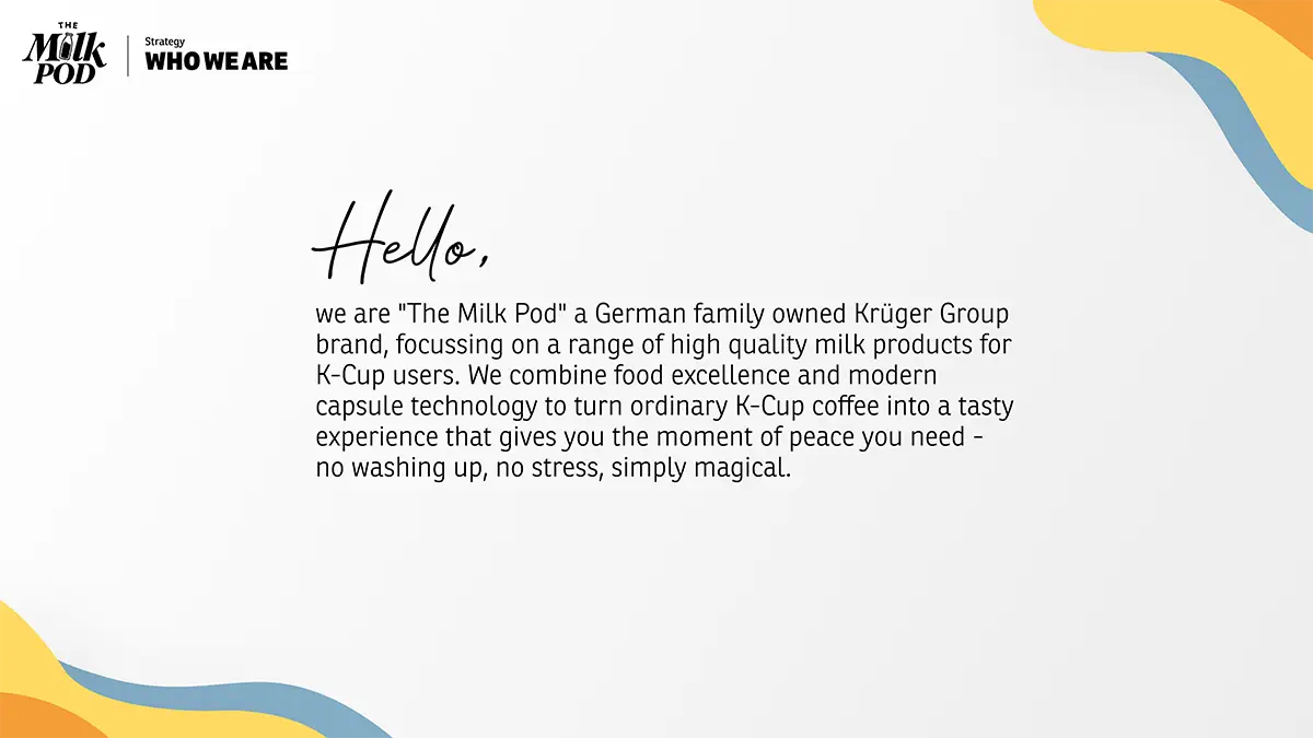
About “The Milk Pod”
The Milk Pod is an innovative direct-to-consumer brand under the umbrella of the KRÜGER GROUP – a renowned, family-owned German food enterprise with over 50 years of experience, operating globally across 22 locations in 11 countries with approximately 5,700 employees.
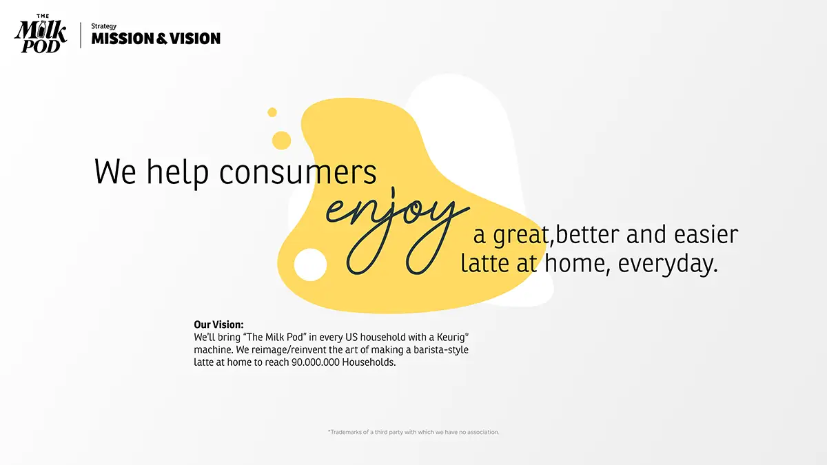
Combining food excellence with modern capsule technology, The Milk Pod delivers premium milk products designed specifically for the 90 million US households that own a Keurig brewing system. The brand’s mission is to reinvent the art of making a barista-style latte at home – turning ordinary single-serve coffee into an indulgent, high-quality, and effortless daily experience.
What I did
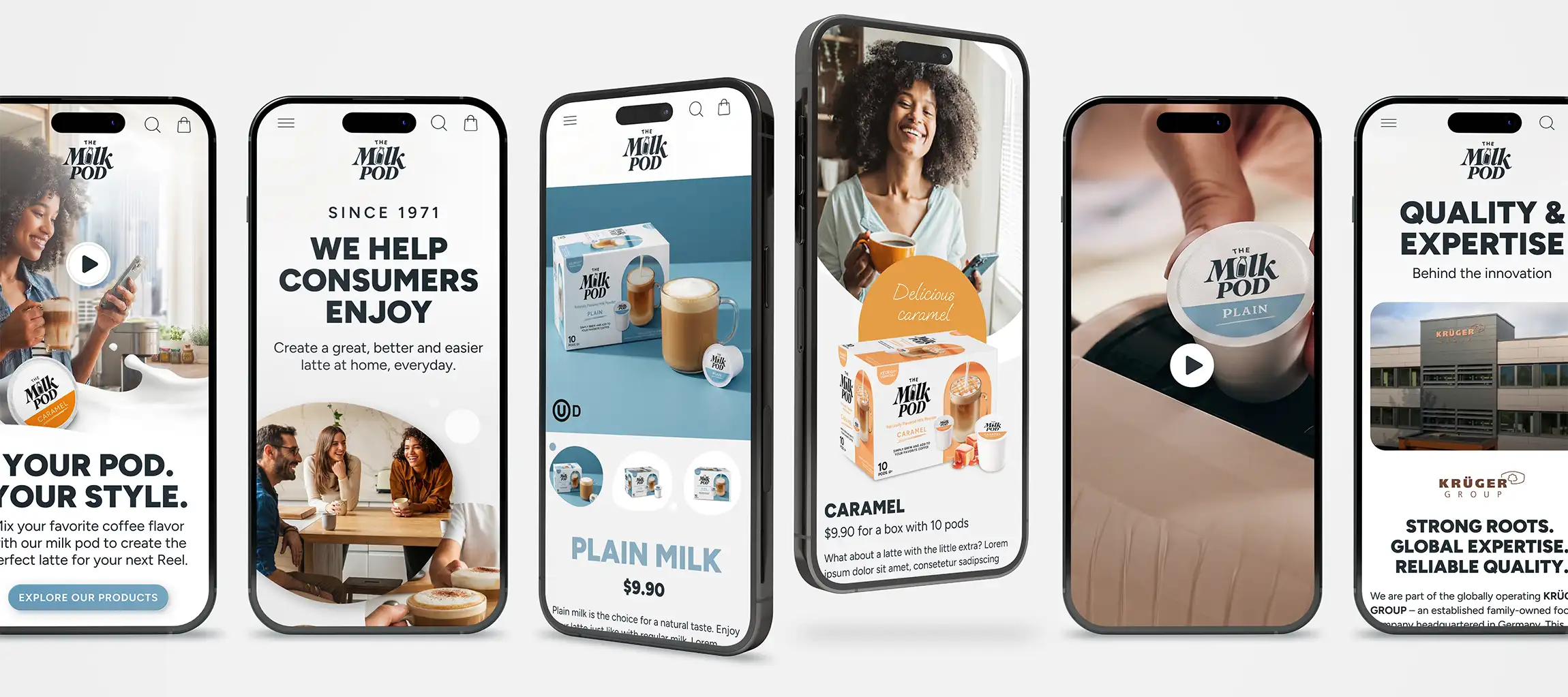
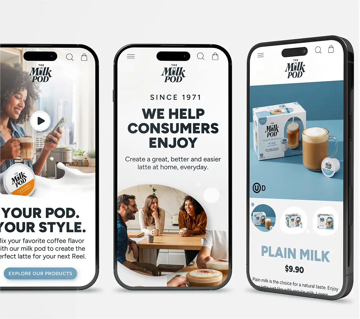
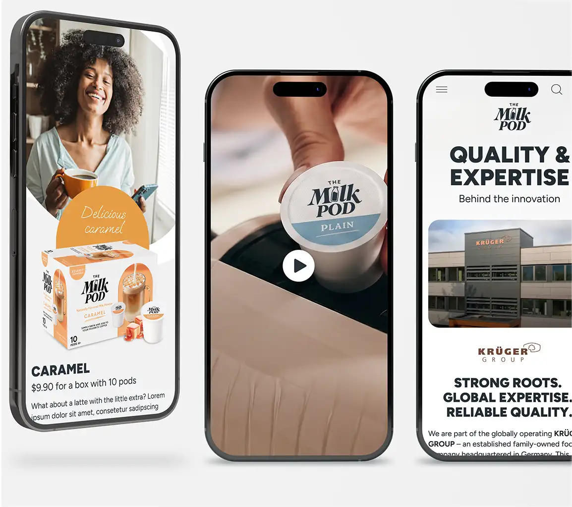
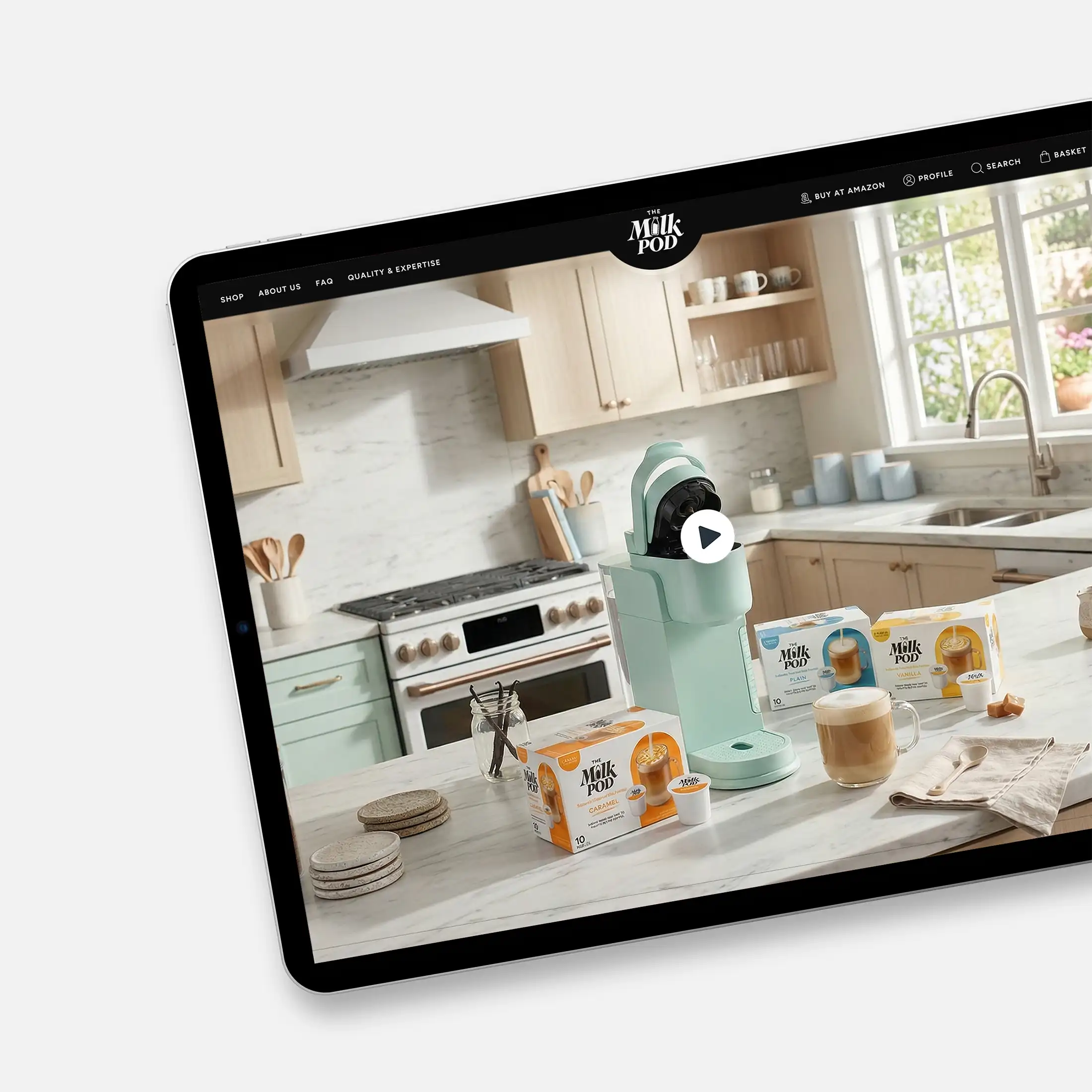
I was responsible for developing the Digital Corporate Design for this product alongside creating the official website, which was later adapted by the US market for The Milk Pod’s market entry.
E-Commerce & Web Design Strategy
Digital Storefront & UX Layout:
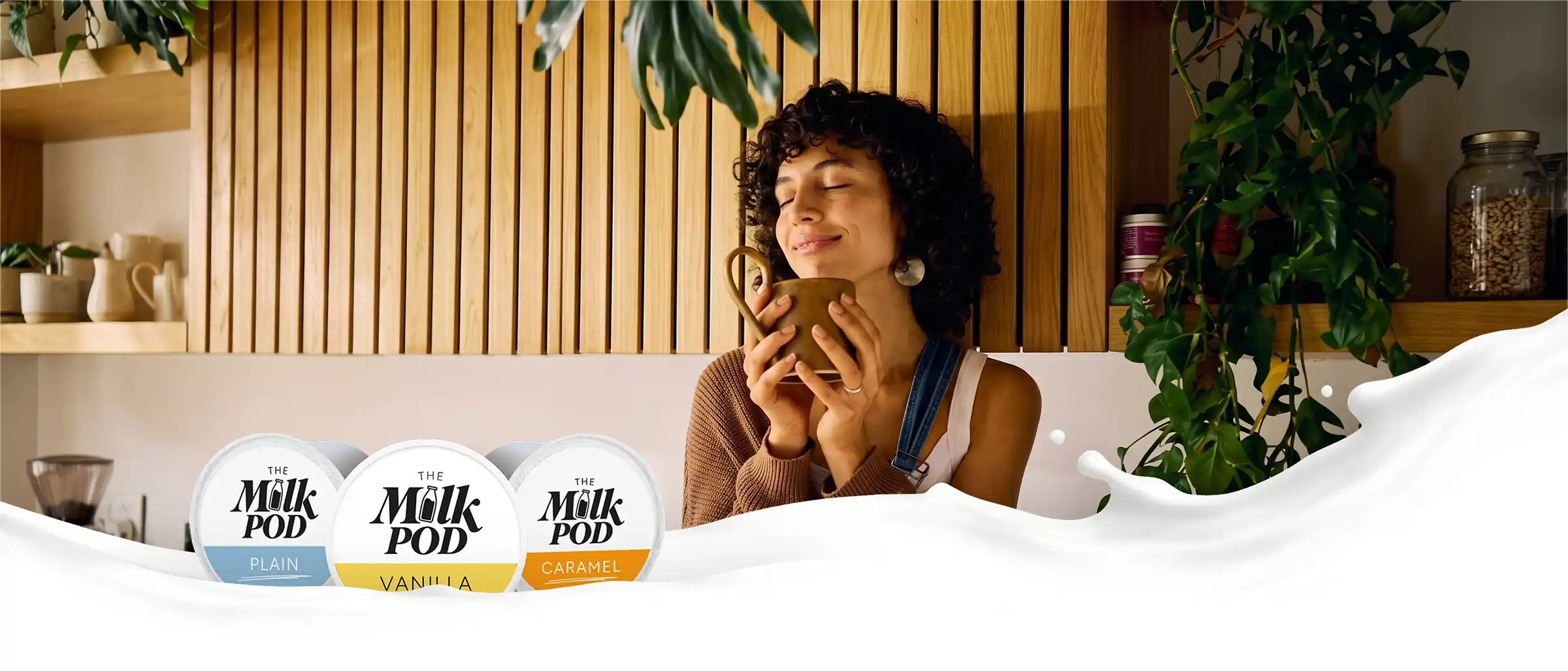
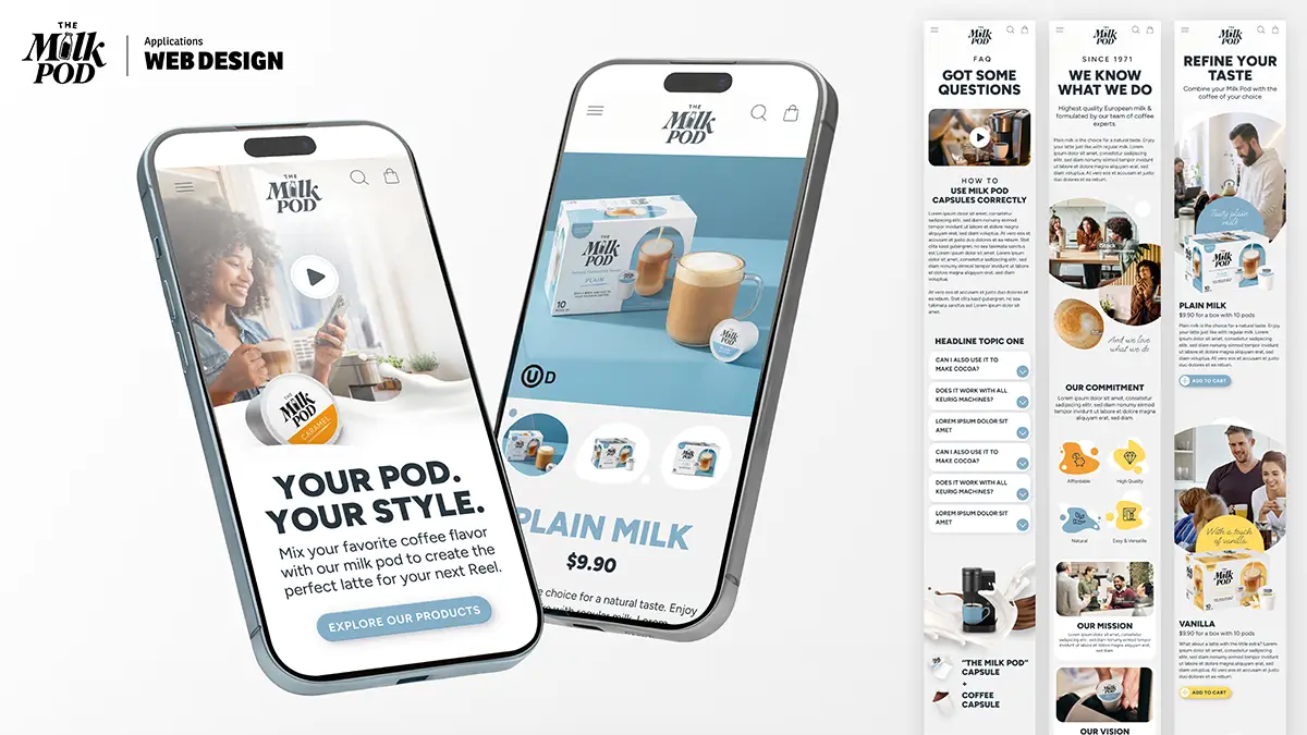
Designed a clean, engaging direct-to-consumer (DTC) website tailored to the US market. The interface guides visitors effortlessly through product discovery, flavor selection (Plain Milk, Vanilla, Caramel), and recipe ideas (“Be Your Own Barista”).
Target Audience Alignment:
Structured page flows and messaging to speak directly to three core buyer personas in the US market.
Visual Identity & Art Direction
Atmospheric Visual Style:
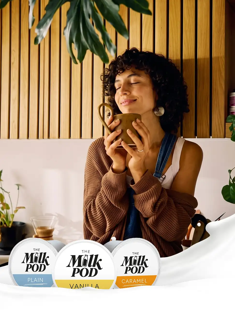
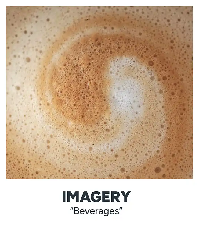
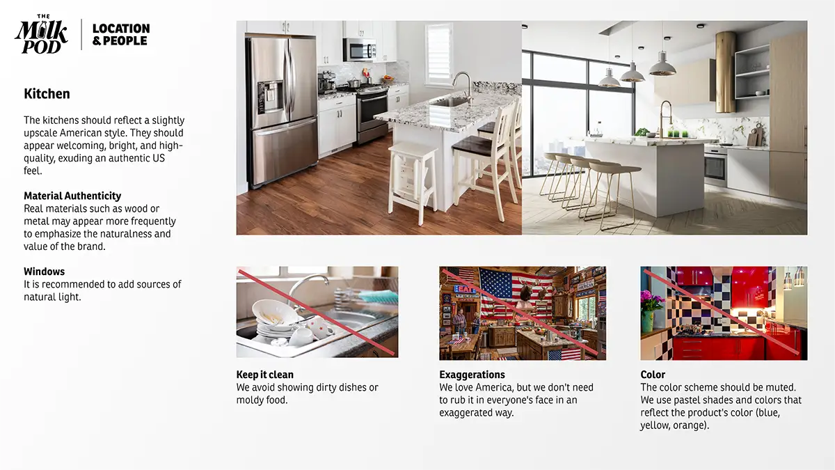
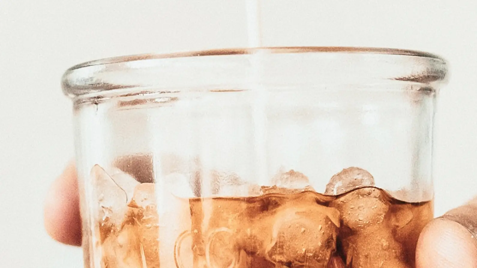
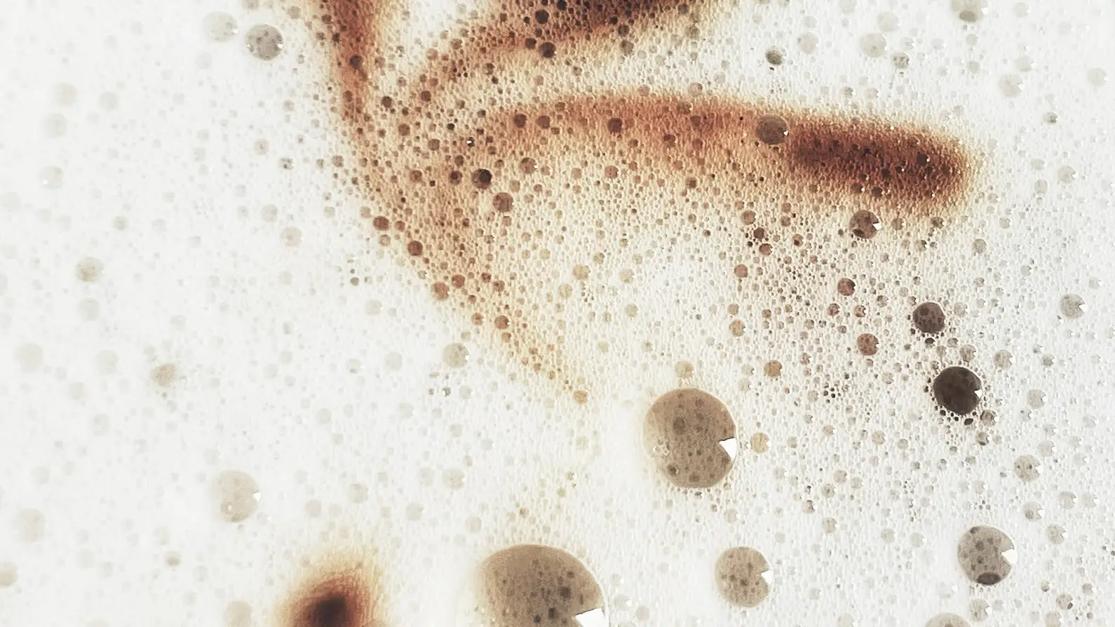
Implemented the brand’s signature style – an authentic, warm, and natural aesthetic that avoids artificial stock looks in favor of relatable, emotional moments in real homes and offices. The visual appearance should radiate a sense of calm – like a good moment of relaxation on a stressful morning.
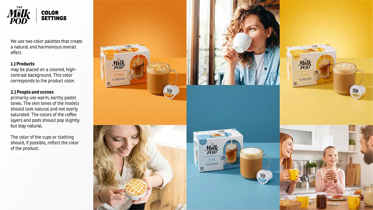
Color Architecture:
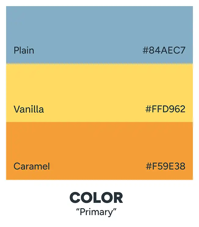
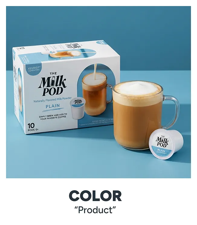
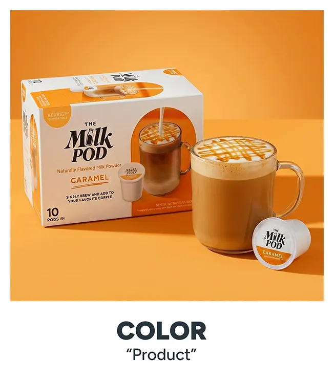
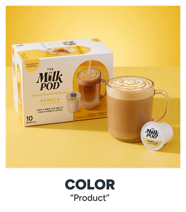
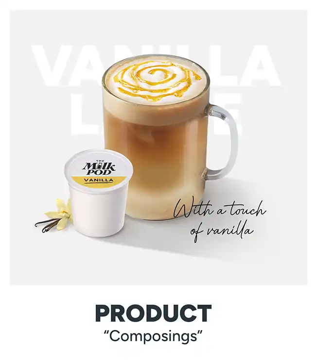
Formulated a dual-palette approach: vibrant, high-contrast colors matching flavor packaging for product highlights, paired with warm, earthy pastel tones for lifestyle scenes and background sections. The product is to be clearly highlighted by the colored underline, thereby gently directing the users’ focus.
Lighting & Photography Guidelines:
Art-directed imagery utilizing natural, directional daylight from windows to create soft depth, warm color temperatures, and natural skin tones. Daylight adds what milk does to coffee: brightening and softening.
Heritage & Value Storytelling
Trust & Quality Integration:
Integrated the KRÜGER GROUP’s strong German heritage (“Quality Made in Germany”) into the narrative to build immediate credibility for a new product category in the US market.
Value Proposition Messaging:
Crafted a reassuring and inspiring tone of voice that bridges the gap between high-end barista quality and effortless everyday simplicity – delivering a feeling like warm milk poured over coffee on a slow Sunday morning.
Client:
– Krüger Group
– The Milk Pod
My Role:
Freelance Creative Director and Digital Product Designer.

01
THE CORPORATE DESIGN
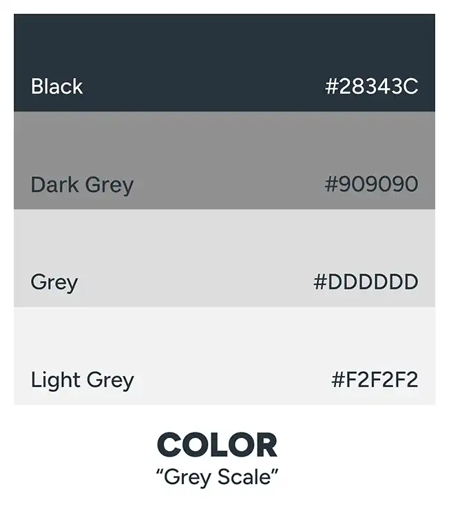
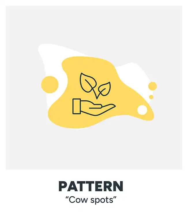
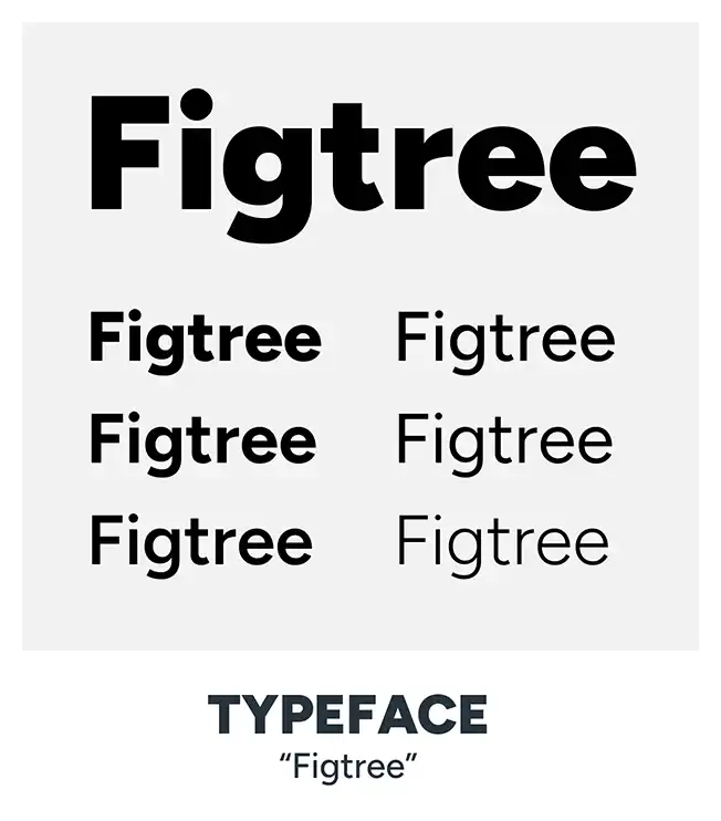
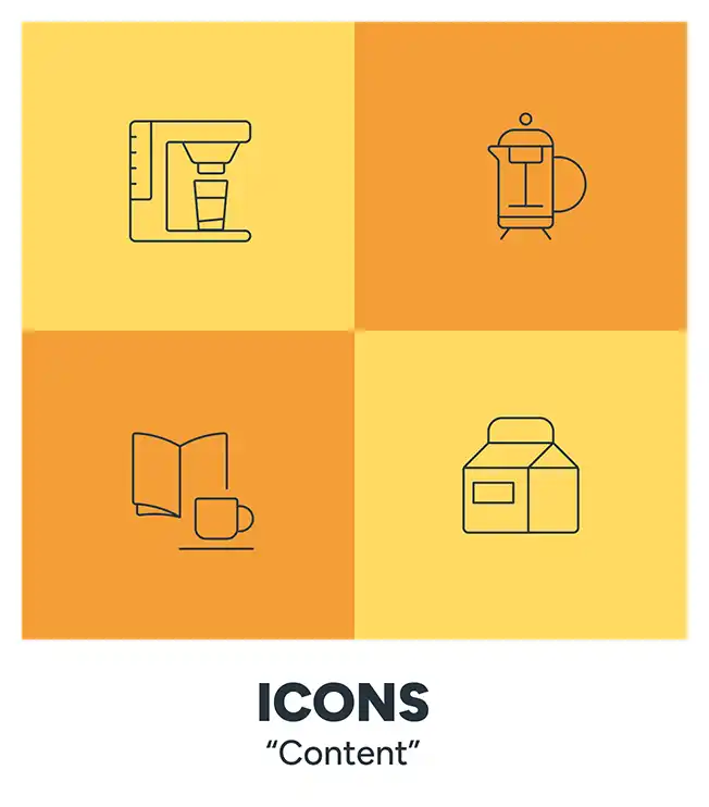
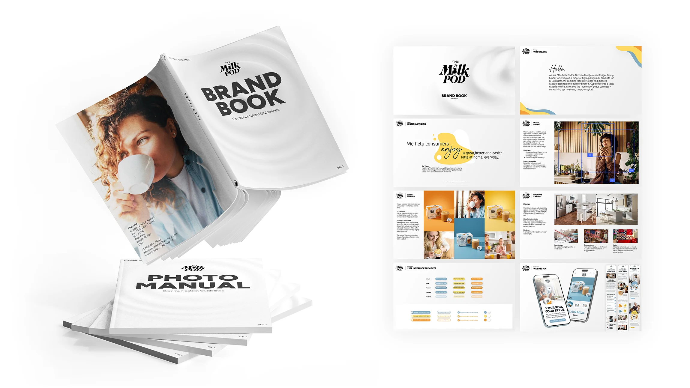
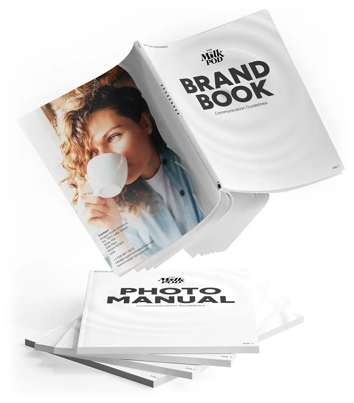
Carefully conceived design elements – taking into account neuroaesthetics and consumer behavior – form the corporate design and serve as the foundation of a strong brand. Guidelines for their proper application have been documented in a brand book.


02
WEBSITE DEVELOPMENT
Carefully conceived design elements – taking into account neuroaesthetics and consumer behaviour – form the corporate design and serve as the foundation of a strong brand. Guidelines for their proper application have been documented in a brand book. Through their design, the capsules are elevated from an inexpensive consumer good to a valuable enhancement of everyday life.
Color Hierarchie
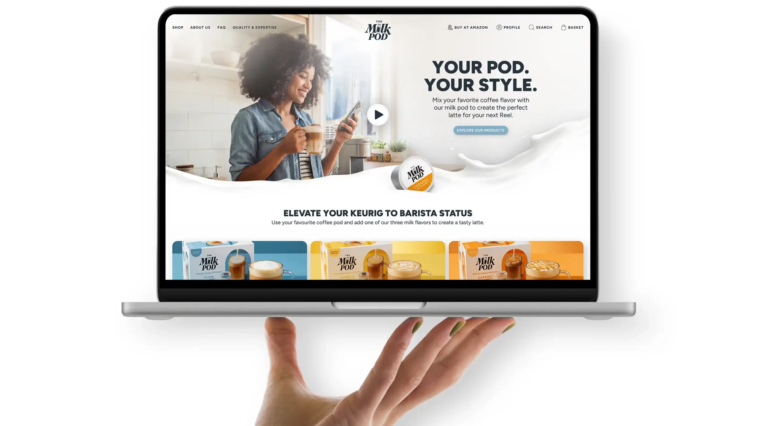
Color guides the user’s eye to key elements: headlines, the product, and the call to action. Generous white space conveys a sense of calm and lends the brand a premium look.
UI Design
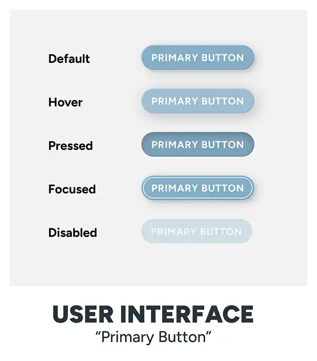
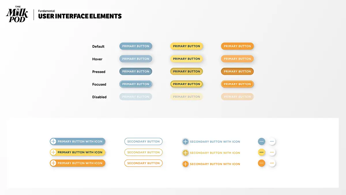
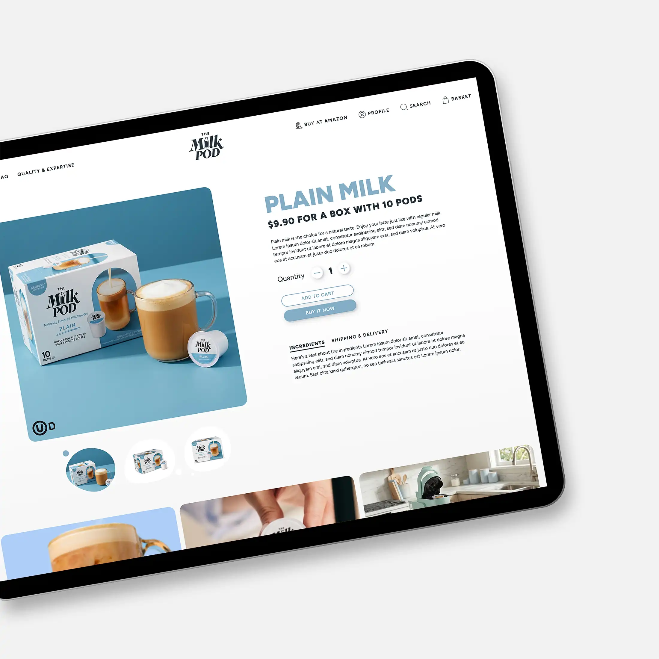
Viewed from above, a capsule is round. True to the philosophy that “form follows product,” this concept was incorporated into the UI design. Round buttons and rounded corners not only echo the product’s design language but also evoke a sense of gentleness and humanity, while minimizing the perception of danger and risk.
Unusual Shapes
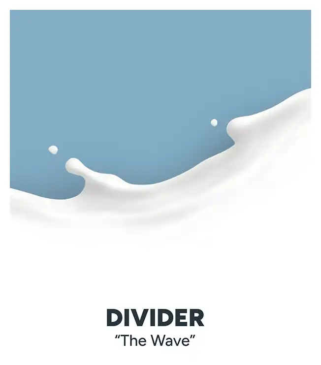
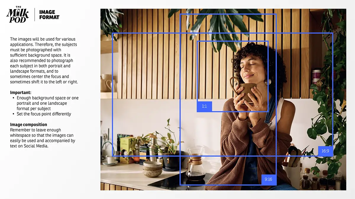
When you pour milk onto a surface, you do not get a perfect circle but rather an organic shape – sometimes elongated, sometimes compressed, yet always rounded. We used shapes like these for the images. The image formats are not always rigid 16:9 or 1:1 ratios. They are organic and free-form – inspired by nature.
These shapes are also used as backgrounds for icons.