
Guide — Rebranding
Rebranding: 7 signs your brand needs an update
Your brand needs a rebranding when it no longer shows who your company is today. Seven signs and a short self-test help you judge it honestly.
You rarely notice it in a single moment. You notice it in many small frictions: a pitch where you have to excuse the slides, a website that looks older than your offer, clients who place you wrongly.
This page shows you seven typical signs and a short self-test. It also helps you decide whether you need a rebranding or a targeted update would do.
I’m Christoph Gey, Creative Director and Digital Product Designer. For over 15 years I have built brands and digital products, for clients including Audi, Volvo and Swarovski.
Rebranding, refresh or redesign:
What is the difference?
The three terms are often mixed up, but they mean different amounts of work and change.
- Brand refresh Logo, palette and typography are updated. Positioning and name stay.
Fits when the brand is right in substance but looks dated. - Redesign The visual identity is redesigned, the strategy stays untouched.
Fits when the look is inconsistent or incomplete. - Rebranding Positioning, identity and message are rebuilt, sometimes including the name.
Fits when the company has changed or the brand no longer carries.
Most companies don’t need a full rebranding. The signs below help you judge that honestly.
The 7 signs your brand needs an update
01 Your brand no longer fits your company
Your company has grown, added services or reached a new audience, but the brand still tells the story of five years ago. You notice it when you have to explain more in conversation than your website says. New clients form the wrong picture before they meet you.
Ask yourselfWould you still introduce your company today with the same words and images?
02 It looks dated or interchangeable
Logo, palette and imagery come from another era, or they look so much like your competitors’ that you could swap them. Whoever doesn’t stand out gets compared on price.
Ask yourselfWould people recognize your logo if the name were missing?
03 Your look is inconsistent
Website, presentations, social media and print look as if they came from different senders. This usually happens gradually, because each application was solved on its own. It costs trust, and every new piece of material costs more time.
Ask yourselfCould someone on your team build a coherent document without asking anyone?
04 Your positioning is unclear
Clients don’t understand what sets you apart, and you describe it a little differently every time. That is not a design problem. It is a strategy problem that shows up in the design. The result: poorly matched requests and long sales conversations.
Ask yourselfCan you say in one sentence what your brand stands for?
05 Merger, new direction or new market
A merger, a sale, a new line of business or a move abroad changes what your brand has to do. If it wasn’t built for that, it slows the change instead of carrying it.
Ask yourselfDoes your brand tell the company’s future, or only its past?
06 Your brand attracts the wrong people
You get requests that don’t fit, or applications from people who don’t belong in your team. Your brand is then sending signals you don’t mean. You spend time on conversations that lead nowhere.
Ask yourselfDo the clients who approach you match the ones you want?
07 You no longer like showing it
You would rather send a plain text email than the presentation, or you find yourself excusing the website. That gut feeling is an honest indicator. If you aren’t excited about your brand, you won’t represent it convincingly.
Ask yourselfWould you be proud if an important client looked at your brand tomorrow?
Does your brand need an update?
Tick what applies to you and count your yes answers.
0 Yes answers
- 0–2 · Your brand still holds. Improve individual points, one at a time.
- 3–4 · A refresh is worth it. Update the look and review the positioning.
- 5–7 · A rebranding is likely the right move. Clarify the strategy first, then build the new identity.
This test doesn’t replace an analysis. It shows you where to look more closely.
When you don’t need a rebranding
Not every frustration is a reason for a rebranding. It costs time, budget and your team’s attention, and it only pays off when the problem runs deep enough.
An update is usually enough when:
- Your positioning is right Only individual applications look dated.
- The need is specific You mainly need a new website or new templates.
- The brand is well known Your clients know and value it.
- The urge comes from boredom Not from real necessity.
That’s why I start with a short Brand Check before we talk about anything bigger.
What this looks like in practice
Two projects show how different the triggers for an update can be.
01 A Bola
Starting pointA Bola no longer felt current. The look was dated and generic, the print edition looked different from the online edition, and the spirit the brand stands for was missing visually. The result was weak traffic and a brand that could not keep up with the market.
Trigger- Our look feels dated or resembles our competitors.
- Our website, presentations and social media look inconsistent.
- We are facing a new market. Web and app design had hardly been a focus before.
- We prefer not to show our brand.
For A Bola, a cornerstone of Portuguese sports journalism, the move from print to digital had diluted its visual soul. The Swiss media group Ringier commissioned me to reimagine and build its digital Corporate Design from the ground up. I set the visual direction and the strategic framework, and the Ringier team realized it technically.
ResultClient and fans welcomed the app and the redesigned digital presence with overwhelming acclaim. Ringier continues to commission me for ongoing and future projects.
02 KulturKenner
Starting pointKulturKenner is the online portal of North Rhine-Westphalia for everyone interested in culture, with events, artist portraits, interviews and history, under the patronage of the Ministry of Culture and Science. The brand did not match the content it represented. It looked cheap and interchangeable.
Trigger- Our look feels dated or resembles our competitors.
- Our website, presentations and social media look inconsistent.
- We receive requests or applications that don’t fit us.
- We prefer not to show our brand.
A digital rebranding. The logo stayed, while the presentation and the color palette changed, so that every piece of content feels like art. As freelance creative director and designer, I covered art direction, user experience, user interface and screen design. I was honored to build it with former colleagues and friends, as a platform for the region’s extraordinary artists.
ResultMore clicks, more cultural entries, more time on page and more leads.
How a rebranding works
A rebranding follows five steps. After each one, you decide whether we continue.
01 Analysis
Brand Check · about 1 weekWe clarify where your brand stands today and what holds it back. At the end you know whether a refresh, a redesign or a rebranding fits.
02 Strategy
2 to 3 weeksWe sharpen positioning, audience and message. This is the foundation for everything designed afterwards.
03 Design
5 to 7 weeksLogo, palette, typography, imagery and applications take shape, including a style guide.
04 Rollout
depends on scopeWebsite, templates, social media and print are switched over. If you want, I support your team along the way.
05 Care
ongoingA brand stays strong only if it is applied and developed further.
Packages and starting prices are on the pricing page.
Frequently asked questions about rebranding
- How often should you revisit a brand? There is no fixed interval. Review your brand every few years, and whenever something fundamental changes in the company: a new offer, a new audience, a merger. Small adjustments happen continuously. A rebranding is the exception.
- Will I lose clients or reach in a rebranding? The risk stays manageable if you deliberately keep what has proven itself and explain the change. On your website, clean redirects make sure rankings and links are preserved.
- How long does a rebranding take? It depends on scope. A Brand Check takes about a week, the strategy phase two to three weeks, the corporate design five to seven weeks. The rollout comes on top, depending on the number of applications.
- Does the logo always have to be redesigned? No. Sometimes it is enough to refine the logo instead of replacing it. What matters is whether it fits the positioning and works across all applications.
- Where do I start? With an honest assessment. Take the self-test above and see where your yes answers pile up. After that, a Brand Check helps you size up the situation in one week.
Is your brand ready for an update?
If you answered yes three times or more, a closer look is worth it. In the Brand Check I look at your brand for a week and tell you honestly whether a refresh, a redesign or a rebranding makes sense. If a project follows within three months, I credit the Brand Check.
Or just write to me briefly about what’s on your mind. I reply personally.

About the Author
These essays are written by Christoph Gey, an independent Creative Director and Digital Product Designer based in Germany. With over 15 years of industry experience, his work focuses on the strategic intersection of premium branding and complex digital products.
Within these articles, he explores the deeper mechanics of design - ranging from brand strategy and user experience to neuroaesthetics. True to the philosophy that form follows meaning, these insights are crafted for decision-makers who believe that enduring brands demand substance, not just decoration.
MORE ESSAYS
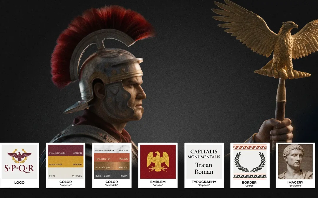
Brand consistency lessons from Rome
Rome ruled five million square kilometres with a handful of fixed rules. What that means for brand consistency, design systems and the freelancers who work inside them.
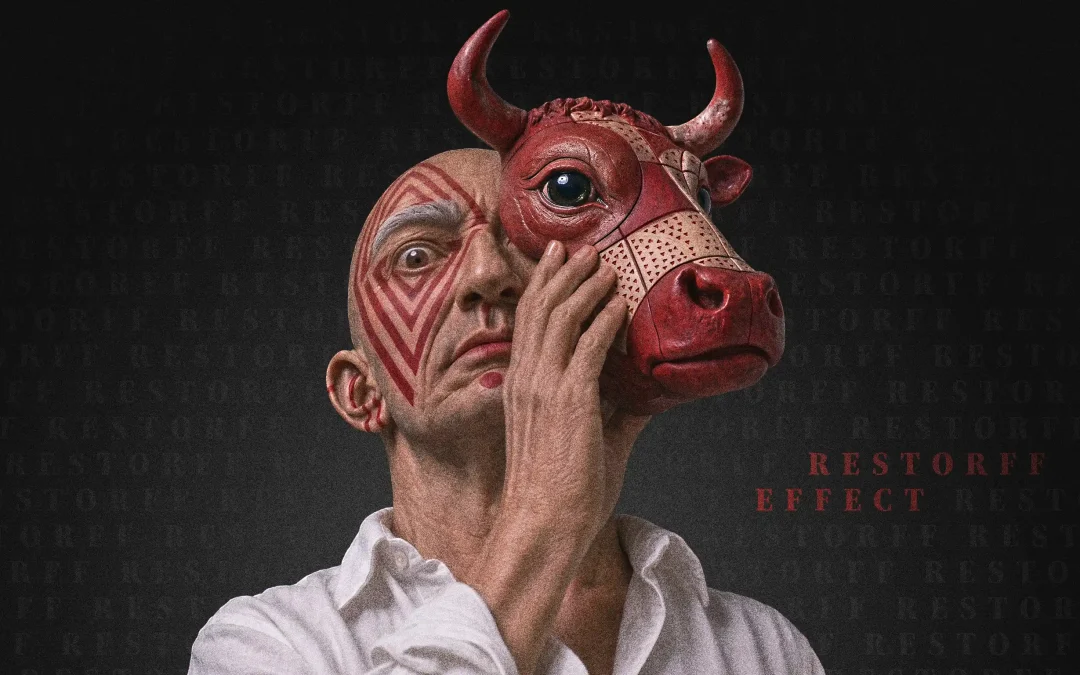
Von Restorff Effect
The Von Restorff effect says the odd one out is remembered. But a brand that only looks different, without changing in substance, trades trust for attention. A look at the neuroscience, UX practice and the trap of cosmetic rebranding.
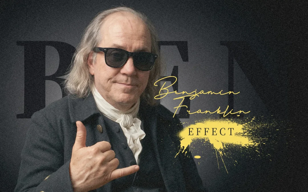
Ben Franklin Effect
Why do we like people more after we have helped them? The Ben Franklin effect turns a simple request into a bond. How it works in people, how brands use it, and what it means for UX design.
Pratfall Effect – neuroscience meets design
Perfection earns admiration. Honesty earns trust. A creative director on the Pratfall Effect, a confession to his boss over a beer, and why the brands we believe are the ones that admit what they are not.
SELECTED WORK
A curated selection of branding and digital product design projects. My work focuses on creating coherent brand experiences that bridge the gap between human perception and functional utility, helping organizations translate complex strategic goals into enduring digital products.