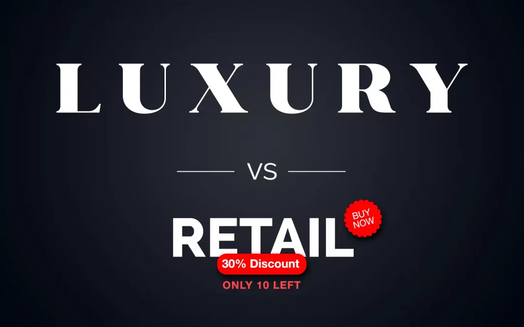
Luxus vs. Einzelhandelsdesign: Die gefährliche Sackgasse der Mitte
Ist Ihr Design ein Rückzugsort oder ein Supermarkt? Die meisten Marken scheitern in der „undefinierten Mitte“ – zu unruhig für Luxus, zu vage für den Massenmarkt. Entdecken Sie, warum die Gestaltung des ersten Blickfelds eine strategische Entscheidung zwischen „Souveräner Stille“ und „Transaktionslärm“ ist und wie Neuroästhetik Ihre Preissetzungsmacht beeinflusst.
Luxury vs. Retail Design: The Dangerous Dead End of the Middle
Is your design a sanctuary or a supermarket? Most brands die in the ‘undefined middle’ – too restless for luxury, too vague for retail. Discover why the first viewport is a strategic decision between ‘Sovereign Silence’ and ‘Transactional Noise,’ and how neuroaesthetics dictates your pricing power.
Where Brand Strategy meets Ancient Symbolism
In a world obsessed with “clean” minimalism and functional geometry, we’ve reached a dangerous plateau of sterile design. But a true icon is more than a pixel-perfect graphic; it is a bridge to the collective unconscious. Drawing on Udo Becker’s Lexikon der Symbole, I explore why the world’s most enduring brands – from Apple to Rolex – don’t just design logos; they weaponize ancient archetypes. Learn why understanding the “coincidence of opposites” is the difference between a fleeting trend and a timeless identity.
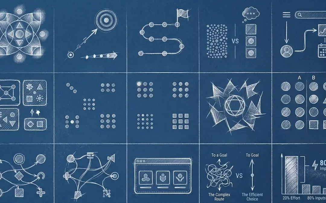
Neuroaesthetics – The Psychology of Aesthetic Depth
Beauty is not decoration. It is a neurological necessity. Explore the intersection of neuroaesthetics and brand experience, and discover why brands with depth require more than just a clear interface. A deep dive into the architecture of perception.
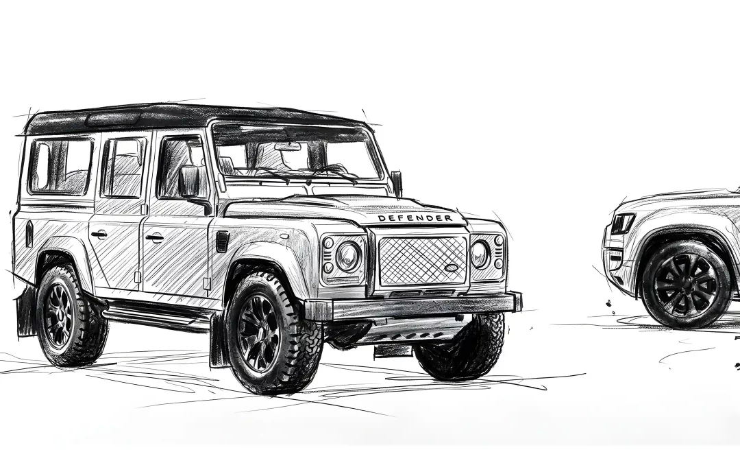
The Anatomy of Defender: Where Reductive Purism Meets Luxury
In a world of hidden complexity, the Defender celebrates the beauty of construction. Beyond the visible screws and exposed magnesium lies a masterclass in brand coherence. This analysis explores the 2026 evolution of an icon: where technical capability meets a new definition of luxury through honesty and strategic depth.
Die Seele der Substanz: Warum Schönheit eine Markenfunktion ist
Ist Ihre „minimalistische“ Marke in Wirklichkeit einfach nur… leer?
Wir haben einen gefährlichen Wendepunkt erreicht. Wir ertrinken in einem Meer steriler, tabellenkalkulationsgetriebener Designs, die „Einfachheit“ mit völliger Seelenlosigkeit verwechseln. Seien wir ehrlich: Viele moderne Designs sind nicht „klar“. Sie sind einfach nur faul.
The Soul of Substance: Why Beauty is a Branding Function
Is your “minimalist” brand actually just… empty?
We’ve reached a dangerous inflection point. We are drowning in a sea of sterile, spreadsheet-driven design that mistakes “simplicity” for a total lack of soul. Let’s be honest: A lot of modern design isn’t “clean.” It’s just lazy.
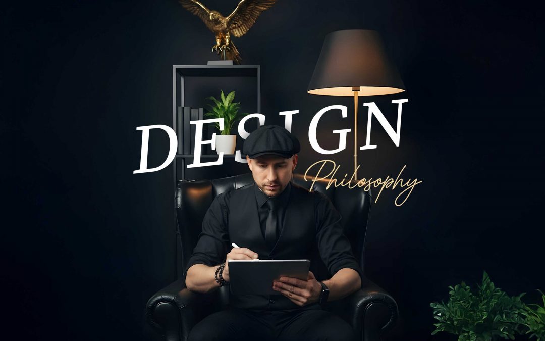
Design Philosophy: Synchronizing Strategy and Emotion for Brands with Depth
Exploring the evolution of design from mere function to emotional resonance and, ultimately, to meaning. This article examines why brands with depth require a philosophy rooted in honesty and ethical integrity – where form follows more than just a feeling.
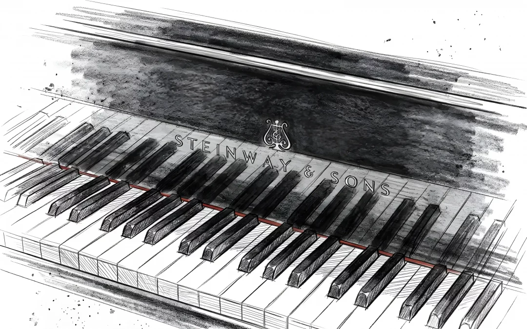
The Architecture of Permanence: What Steinway & Sons Teaches About Holistic Brand Experience
True brand excellence is a result of quiet, consistent alignment. By examining the anatomy of Steinway & Sons—from technical superiority to their digital-analog interface—we find a blueprint for modern brand architecture. An insight into how strategy and pixel-perfection merge to form a coherent, lasting legacy.
- Building relationships – Win people over with design

- Interior – The creative space that designes with you

- Führung von Designteams: Introvertierte Menschen vs. Verstecker

- Leading Design Teams: Introverts vs. Hiders
- The Anatomy of a Choice: Why Logic is Just a Supporting Actor in Branding

- I DON’T WORK FOR ASSHOLES

- Global brands based on religion

- A pencil doesn’t write a novel. And AI doesn’t build a brand. It needs brilliant minds.

- The ROI of Memory: Why Neuroaesthetics Drives Brand Retention in an AI World

- The Golden Second: Why Frictionless UX is the Enemy of High-End Desire
