
by Christoph Gey | Mar 23, 2026 | Corporate Design
Is your design a sanctuary or a supermarket? Most brands die in the ‘undefined middle’ – too restless for luxury, too vague for retail. Discover why the first viewport is a strategic decision between ‘Sovereign Silence’ and ‘Transactional Noise,’ and how neuroaesthetics dictates your pricing power.

by Christoph Gey | Mar 17, 2026 | Corporate Design
In a world obsessed with “clean” minimalism and functional geometry, we’ve reached a dangerous plateau of sterile design. But a true icon is more than a pixel-perfect graphic; it is a bridge to the collective unconscious. Drawing on Udo Becker’s Lexikon der Symbole, I explore why the world’s most enduring brands – from Apple to Rolex – don’t just design logos; they weaponize ancient archetypes. Learn why understanding the “coincidence of opposites” is the difference between a fleeting trend and a timeless identity.

by Christoph Gey | Mar 13, 2026 | User Experience
Beauty is not decoration. It is a neurological necessity. Explore the intersection of neuroaesthetics and brand experience, and discover why brands with depth require more than just a clear interface. A deep dive into the architecture of perception.

by Christoph Gey | Mar 9, 2026 | Brand Analysis
In a world of hidden complexity, the Defender celebrates the beauty of construction. Beyond the visible screws and exposed magnesium lies a masterclass in brand coherence. This analysis explores the 2026 evolution of an icon: where technical capability meets a new definition of luxury through honesty and strategic depth.
by Christoph Gey | Mar 9, 2026 | Design Philosophy
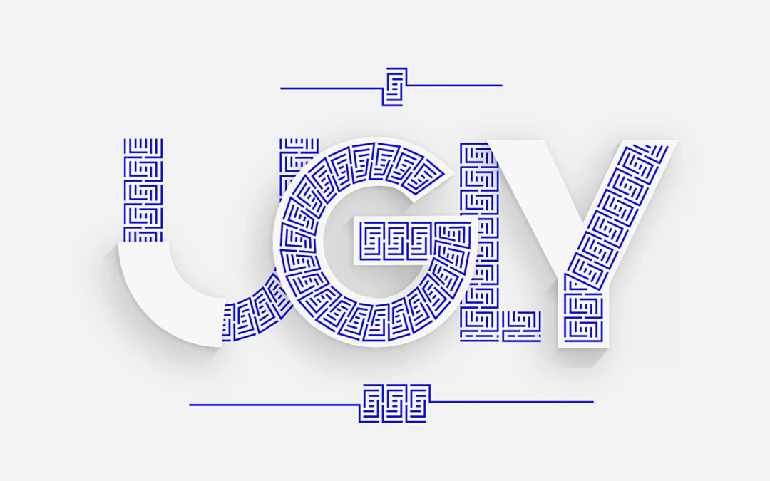
Is your “minimalist” brand actually just… empty?
We’ve reached a dangerous inflection point. We are drowning in a sea of sterile, spreadsheet-driven design that mistakes “simplicity” for a total lack of soul. Let’s be honest: A lot of modern design isn’t “clean.” It’s just lazy.

by Christoph Gey | Feb 26, 2026 | Design Philosophy
Exploring the evolution of design from mere function to emotional resonance and, ultimately, to meaning. This article examines why brands with depth require a philosophy rooted in honesty and ethical integrity – where form follows more than just a feeling.
by Christoph Gey | Feb 25, 2026 | Brand Analysis
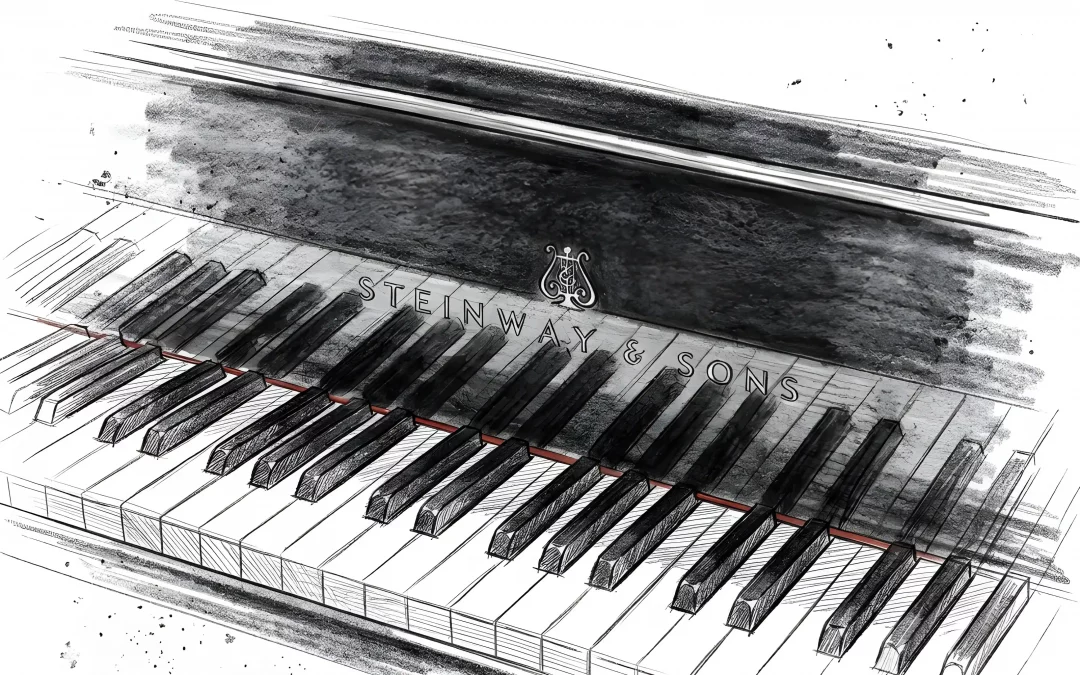
True brand excellence is a result of quiet, consistent alignment. By examining the anatomy of Steinway & Sons—from technical superiority to their digital-analog interface—we find a blueprint for modern brand architecture. An insight into how strategy and pixel-perfection merge to form a coherent, lasting legacy.
by Christoph Gey | Feb 24, 2026 | Brand Analysis
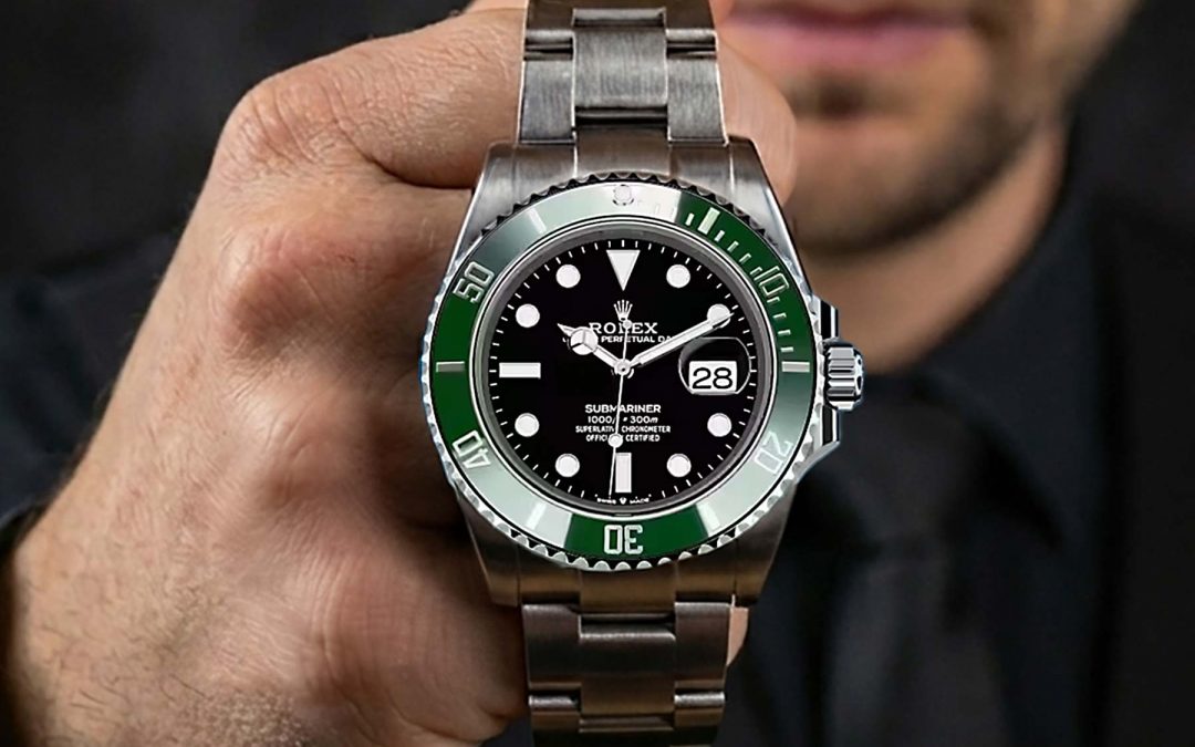
The Silent Authority of Consistency.
Growth often breeds ambiguity. As brands scale, strategy and execution inevitably drift apart. Rolex stands as the absolute antithesis to this blurring – a masterclass in philosophical calmness and radical coherence. In this analysis, I explore why brands with depth demand more than decoration and how the discipline of “Quiet Professionals” remains the gold standard for enduring brand leadership.

by Christoph Gey | Feb 24, 2026 | Brand Analysis
Ferrari is more than a manufacturer; it is a masterclass in strategic coherence. From Enzo’s calculated arrogance to the mathematical perfection of surfaces where light never breaks, this analysis explores how Ferrari aligns every detail to protect its myth. Discover why true luxury is found in the integrity of what you refuse to compromise.

by Christoph Gey | Feb 24, 2026 | Design Philosophy
Is the era of sterile minimalism over? From the “White Room” at Apple to the botanical complexity of the Terra Carta Seal, Sir Jony Ive is redefining the visual language of luxury. This deep dive explores the shift toward “Systemic Opulence,” the crucial role of tactile haptics in a digital world, and why deliberate complexity is becoming the ultimate differentiator in the age of AI-generated design. A reflection on heritage, geometry, and the power of human intention.