About Campari
Campari Soda is one of Italy’s enduring design icons, born in 1932 when Fortunato Depero created the bottle that has become a symbol of Milan’s aperitivo culture.
My task as a Freelance Art Director
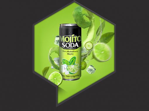
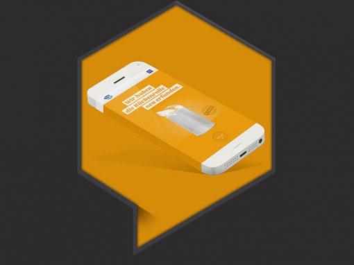
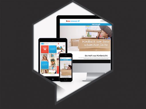
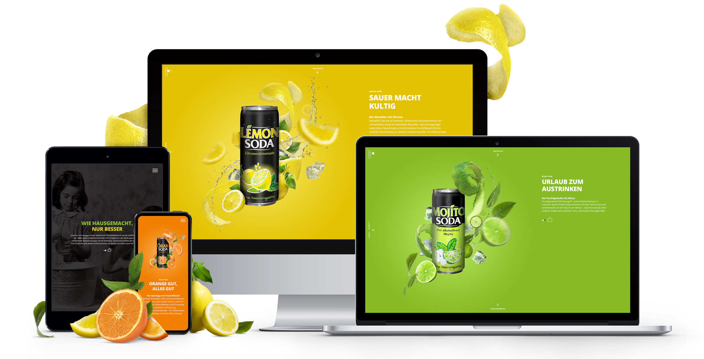
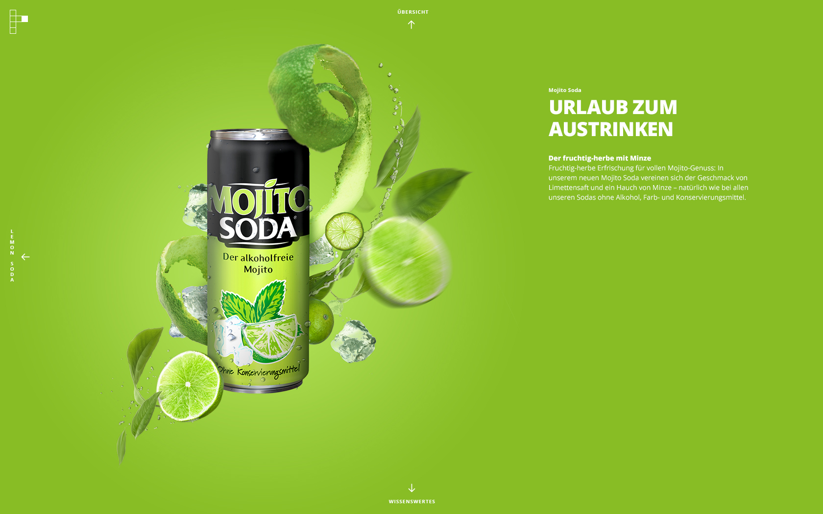
For the Campari Soda project, we were commissioned to design a responsive microsite showcasing the brand’s key flavors — Mojito, Orange, and Lemone — and to craft a visual language that gives the product presence and personalityonline.
The Challenge
While the conical Campari Soda bottle is iconic in product design, it lacks visual appeal when presented alone in a digital context. The task was not only to display the product but to elevate it, making it engaging, bold, and unmistakably expressive.
Agency: Isobar Germany
Client: Campari Gruppo
My Role:
– Freelance Art Director,
– Freelance UI Designer,
– Freelance Illustrator
Solution & Design Approach
Old-School Artwork (No AI)
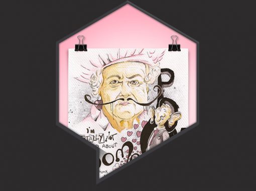
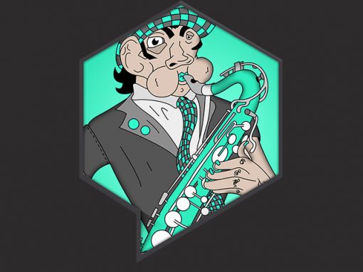
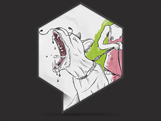
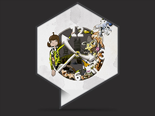
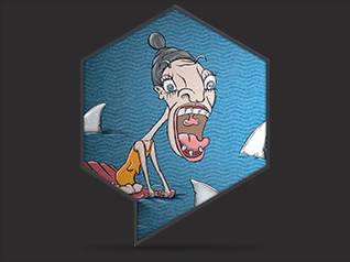
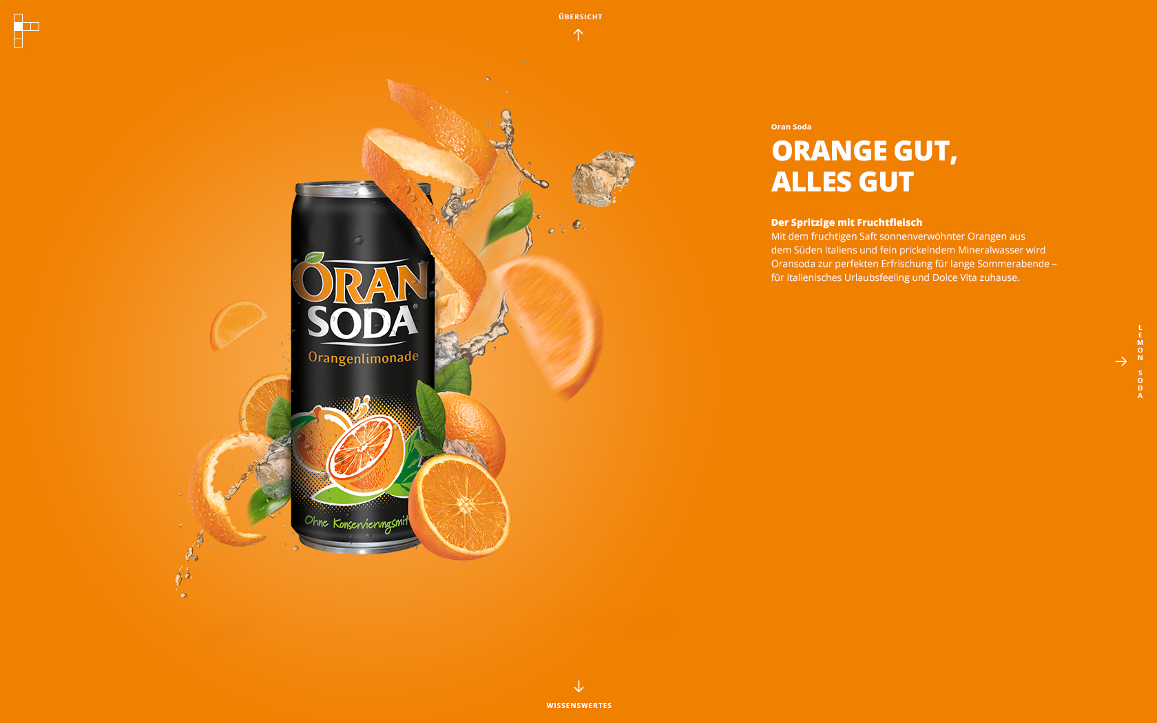
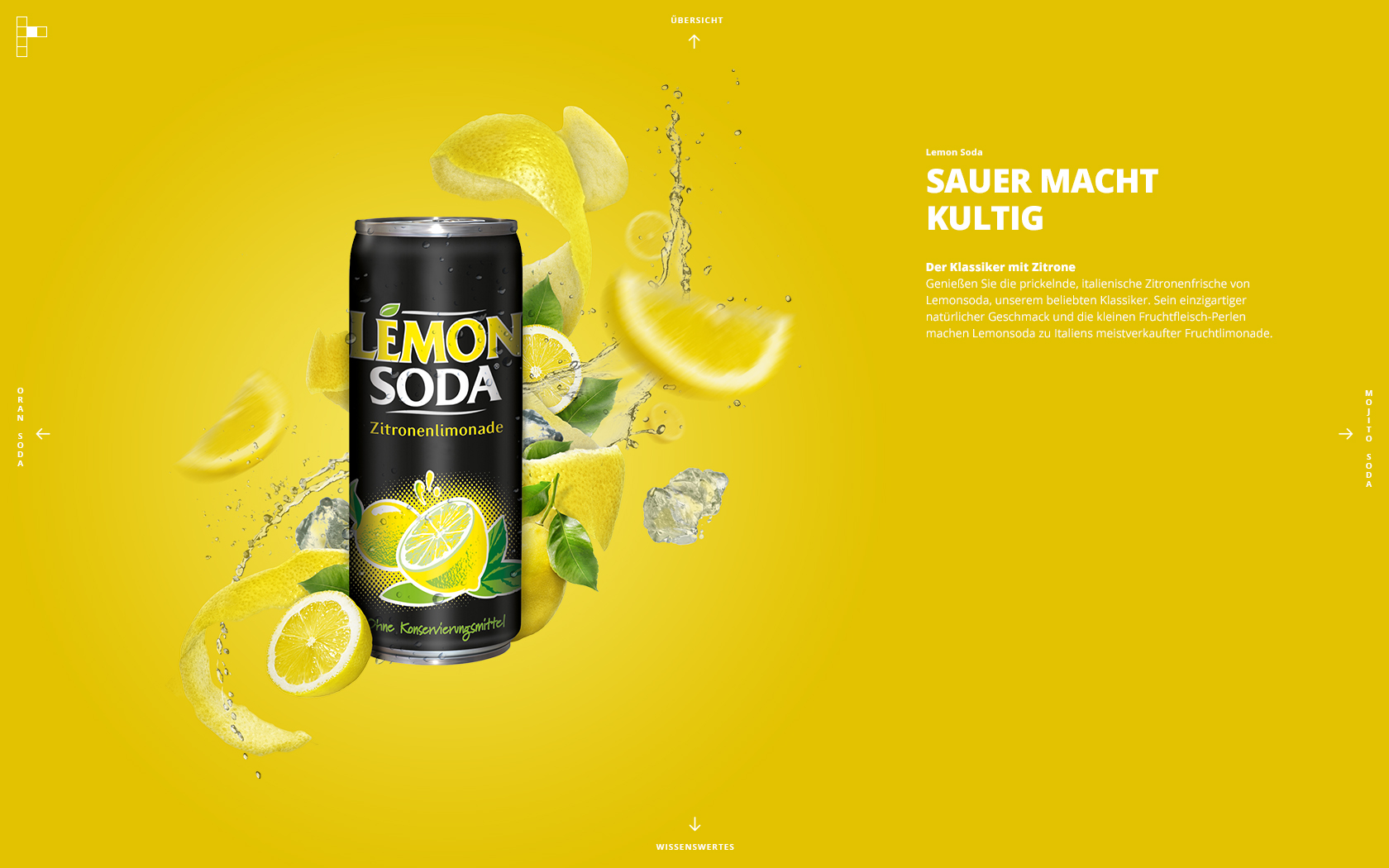
All visuals were created manually in Photoshop — no generative tools were used. This handcrafted approach brought authentic texture, character, and intentionality to the imagery.
Full-Frame Design
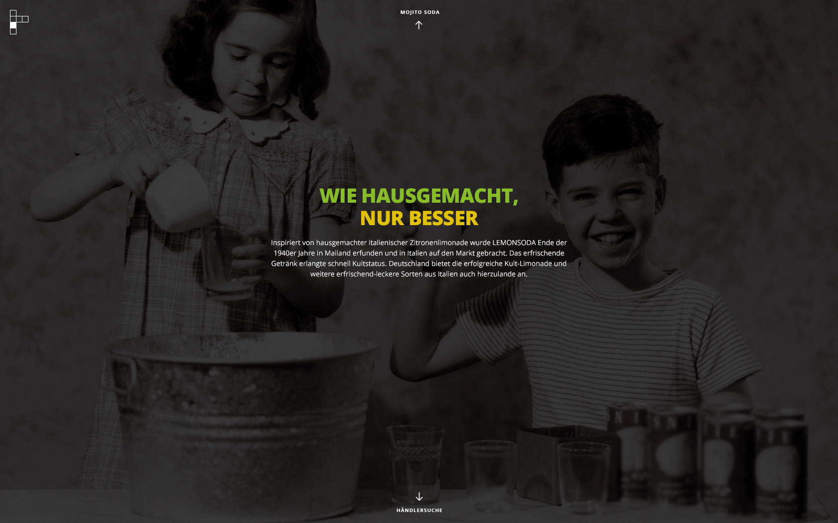
Each section is designed to occupy the full viewport, creating immersive content that feels cinematic across devices — from mobile to desktop.
Intuitive Flow
Despite the visually rich presentation, the user journey remains clean and effortless. The layout guides attention naturally, keeping the experience fluid and engaging.
Animated Can Interactions
The product comes to life through subtle motion — rotating cans, animated transitions, and micro-interaction cues that draw the user deeper into the brand experience.
Pop Art Reference — Warhol Inspiration
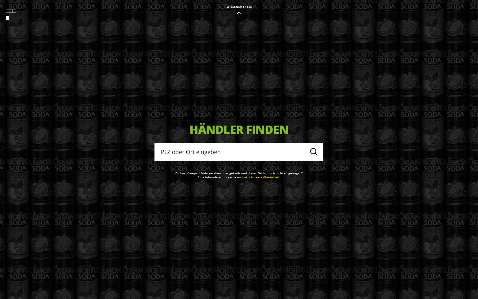
Visually and conceptually, the design winks at Andy Warhol’s Campbell’s Soup Cans series, elevating a packaged everyday object into cultural expression and visual narrative.
Creative Surrounding
Recognizing the original cans lack visual drama on their own, we built a surrounding graphic universe that amplifies impact and context — shape, color, rhythm, and movement work together to reframe the product as art.
Michael Brandt
Freelance Art Director
Christoph Gey
Project Manager
Stephanie Zabel
Developer
Marcin Ciesielski

