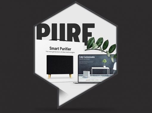
Pure air needs pure design
ONE LIFE is a high-end health product introduced at a stage when the physical product was still in development. There was no finished prototype, no product photography, and no trust signals such as certifications, awards, or long-term studies. Despite these limitations, the challenge was to create a compelling brand experience that conveyed premium quality and immediate trust — even before the product existed in finished form.
Challenge
-
The product was in an early, evolving concept phase.
-
No physical product photography could be produced.
-
The brand had no industry recognition or proof points yet.
-
Health is deeply personal and often evokes fear or sterility.
-
The experience had to communicate trust, usefulness, and lifestyle fit quickly and with clarity.
The core challenge was clear: Create instantly recognizable premium trust and identity for a product with no existing proof, while avoiding clinical sterility.
Agency: Freelance
Client: OneLife GmbH
My role:
– Creative Direction
– Art Direction
– Conception
– Illustration
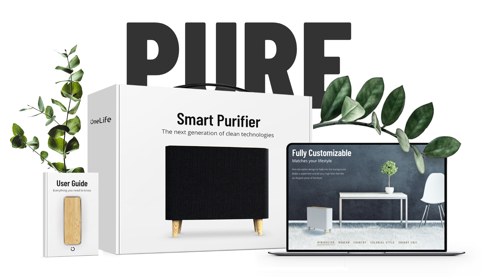
Strategic Approach
Trust Before Proof
As a new health product without certifications, studies, or market validation, the design had to communicate trust instantly. The visual language needed to say: “This product is reliable, thoughtful, and operates on the same level as premium consumer technology.”
To achieve this, the brand was deliberately aligned with a high-end tech aesthetic familiar to users of Apple products—without copying Apple’s branding. This visual familiarity reduced friction and created an immediate sense of confidence and quality.
Interior Integration
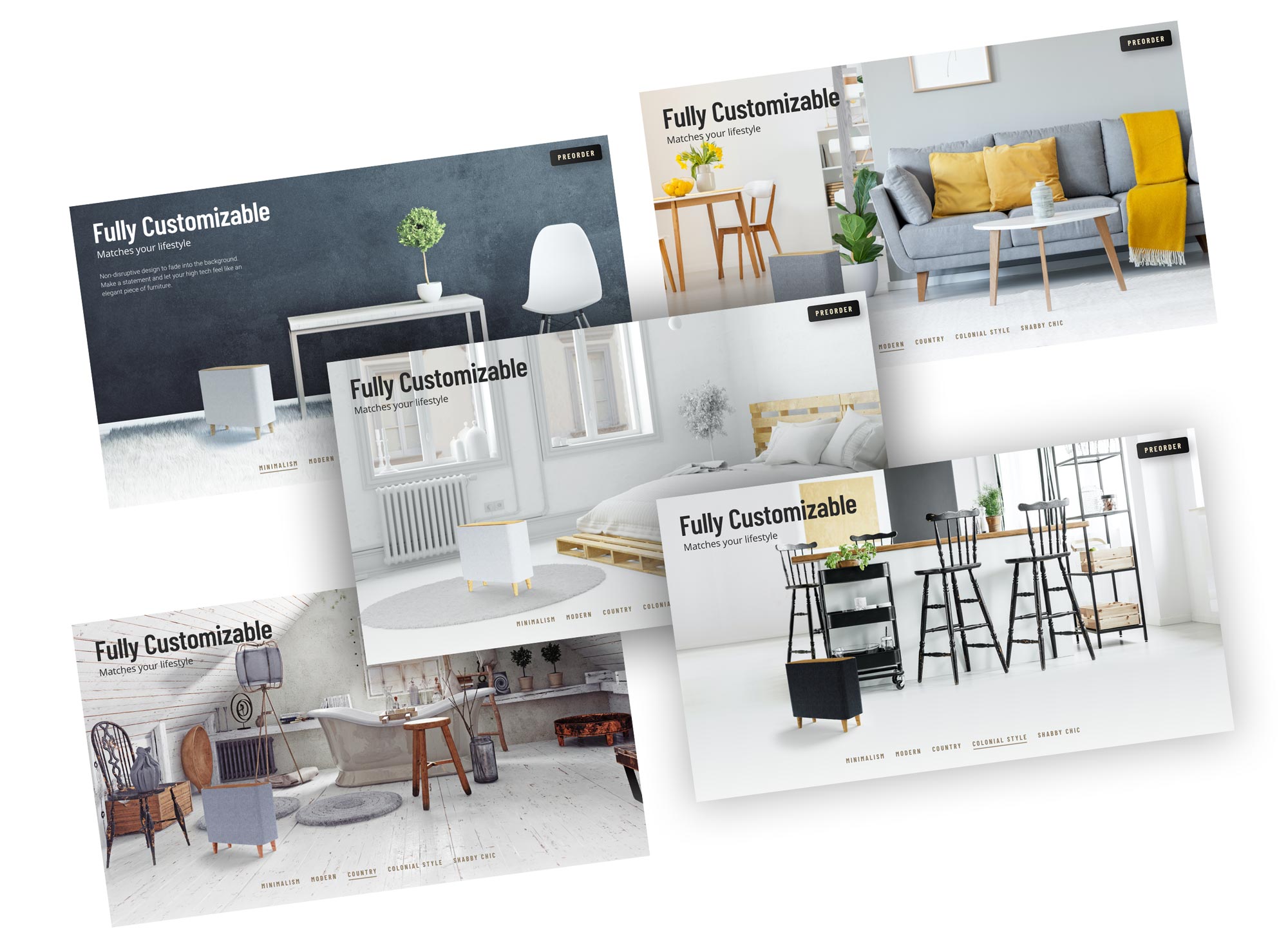
High-quality renderings place the product in different environments: Kitchen, Bathroom, Living room, Attic … The product visually blends into each interior instead of dominating it.
Design Approach
Premium, Reduced, Timeless
The design language is minimal and calm, focusing on clarity and longevity rather than trends. Extensive use of white space to emphasize premium quality. A restrained layout that allows content and product visuals to breathe. A strong, independent visual identity without visual noise. The guiding principle was: “We communicate what we are.”
Motion & Interaction
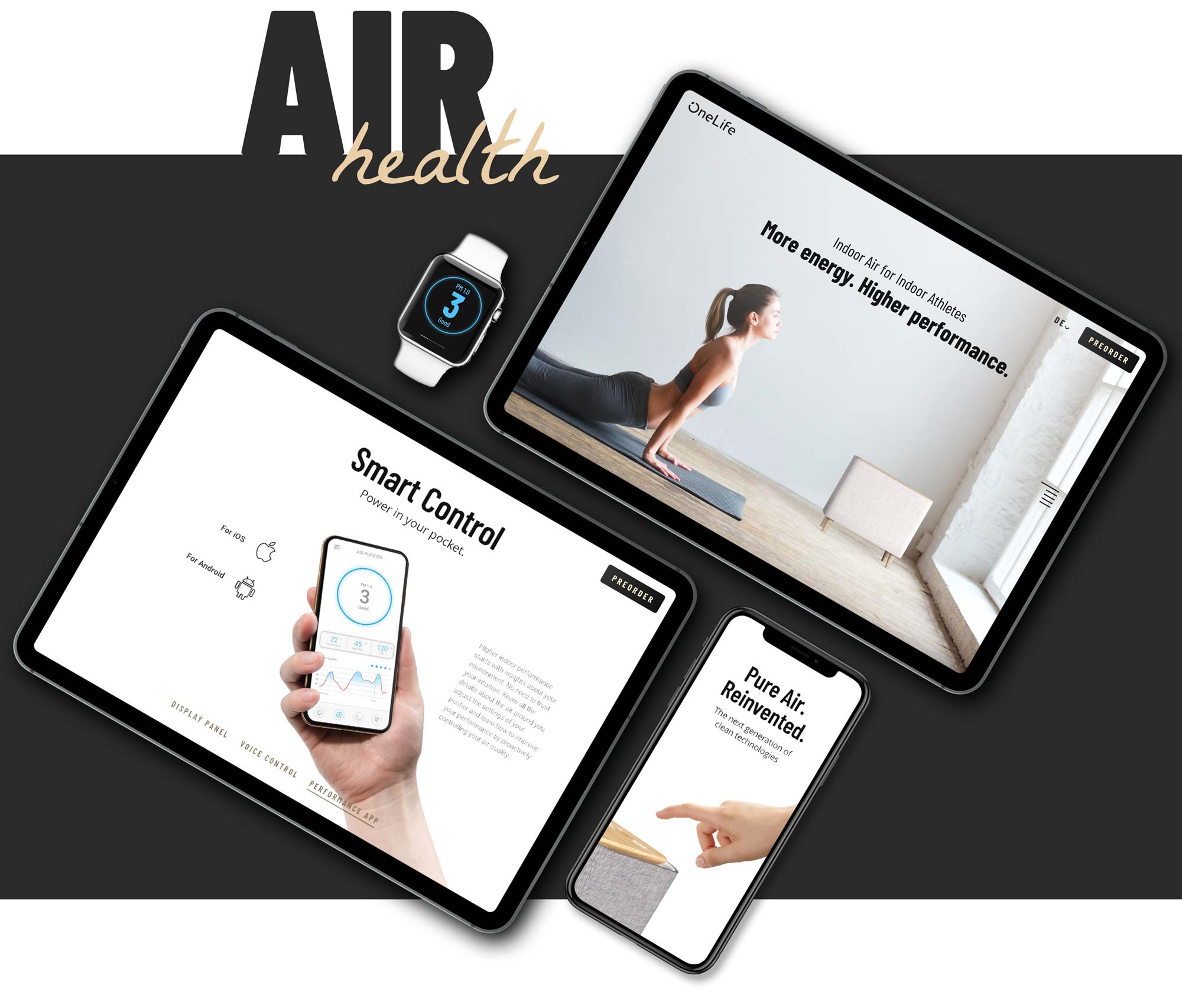
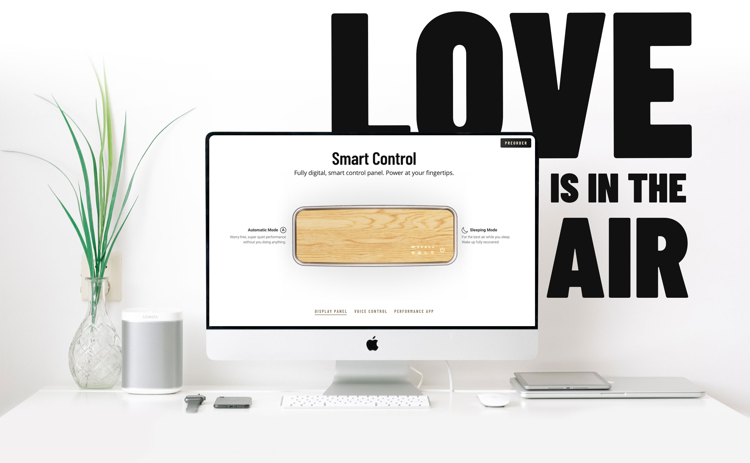
Subtle animations and parallax scrolling were used to elevate the experience without distraction: Small, precise animations reinforce the premium feel. Parallax scrolling adds depth and calm storytelling. Motion is purposeful, never decorative.
Functional Communication
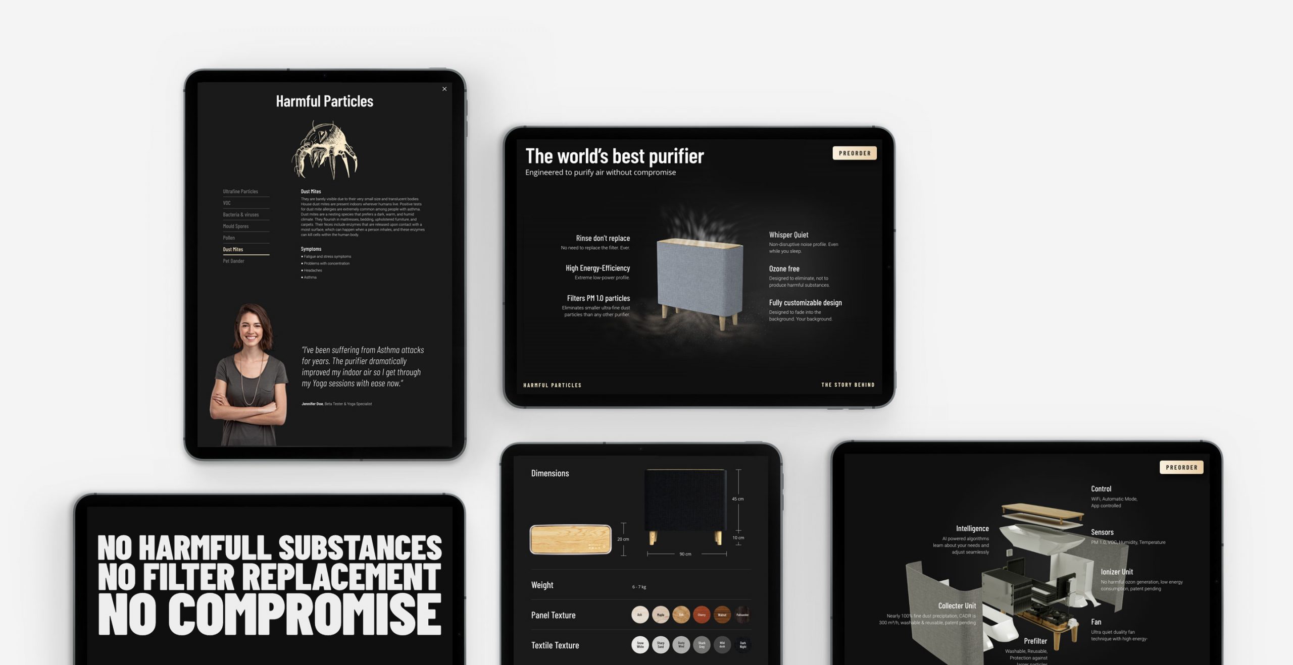
Beyond brand positioning, the website also serves an educational purpose:
Explaining how the product works
Providing clarity about bacteria and viruses
Showing how the product actively combats them
Complex topics are translated into clear, understandable content — reinforcing trust through transparency.

Visual System
Color Palette
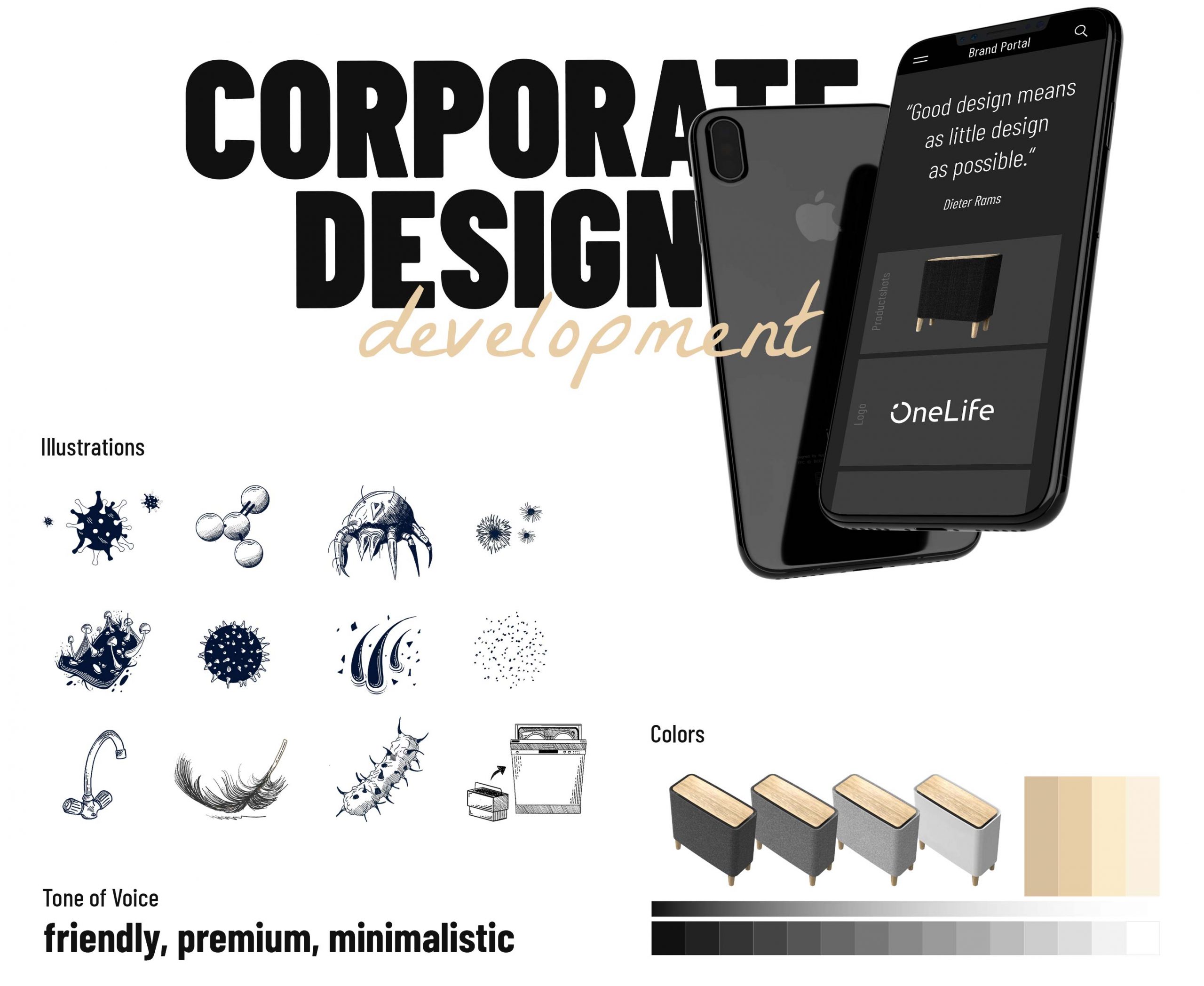
The color scheme was derived directly from the product itself:
- White and black as the dominant base
- Warm brown accents inspired by the wooden elements of the product (spruce, oak, etc.)
This approach visually merges brand and product, reinforcing authenticity and coherence.
Typography
-
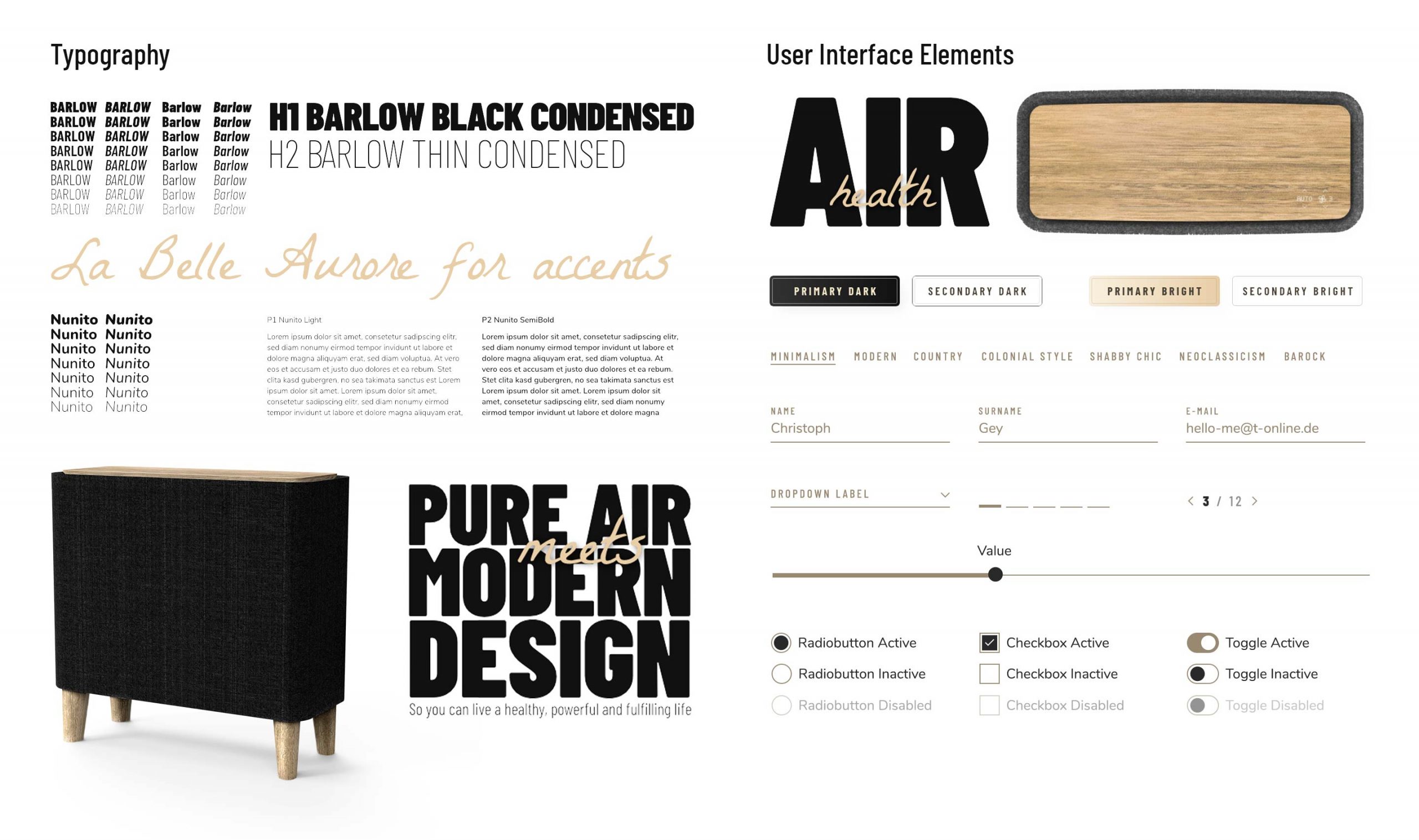
Extremely large, confident typography conveys self-assurance
-
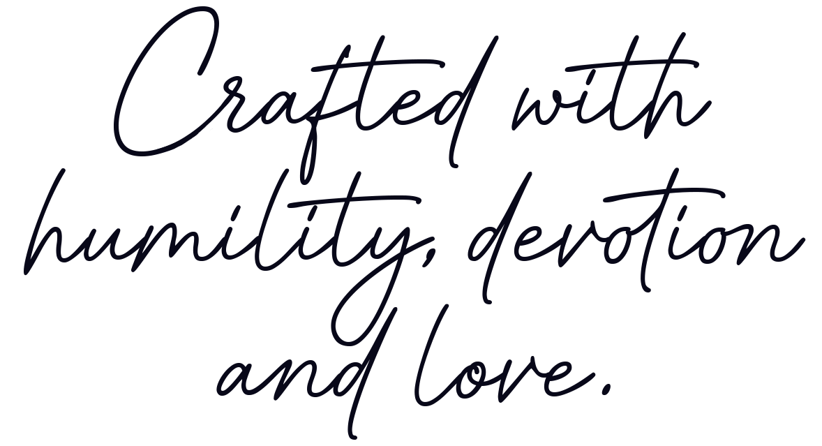
Combined with a handwritten type style to introduce warmth and humanity
The balance communicates:
“We know what we’re doing — without being arrogant.”
Illustrations & Humanity
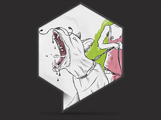
Health is deeply personal. To avoid feelings of sterility or disgust often associated with bacteria and viruses, handmade illustrations were created.
These illustrations:
-
-
Humanize the brand
-
Reduce emotional distance
-
Counteract negative associations with germs and medical imagery
-
Strengthen the premium and crafted character of the product
-
Imagery & Lifestyle Positioning
Since no real product photography was possible, high-quality renderings were integrated into realistic lifestyle scenes.
Key principles:
-
The product adapts to the user’s interior — not the other way around
-
Integration into warm, tasteful living spaces
-
Plant-based elements to avoid a clinical or medical look
The underlying idea:
“We adapt to you. You don’t need to adapt to us.”
Result
The final experience positions ONE LIFE as: A high-end, trustworthy health product. A lifestyle object that blends seamlessly into modern interiors. A confident yet human brand. Despite the absence of a finished product, the brand successfully communicates quality, reliability, and emotional credibility from the very first interaction.
Agency
Freelance
Client
OneLife GmbH
Christoph Gey
Concepter
Christoph Gey
Robin Herter
Creative and Art Direction
Christoph Gey
Consultant
Robin Herter
Illustration
Christoph Gey
Developer
Manuel Schiller
Animation
Markus Riedle

