Ca Go
Redefining Safety and Trust in Premium Cargo Mobility
Overview
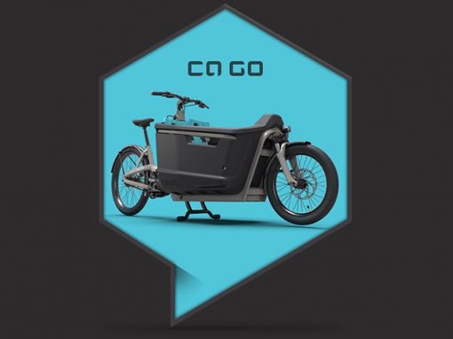
CA GO is a high-end cargo bike brand with a clear ambition: to rethink urban mobility by putting safety, design quality, and trust at the center of the experience.
The challenge was to build a brand and digital presence that could confidently compete on the same level as premium automotive brands — while operating in a category where safety communication had long been a blind spot.
Approach
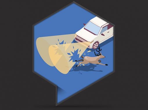
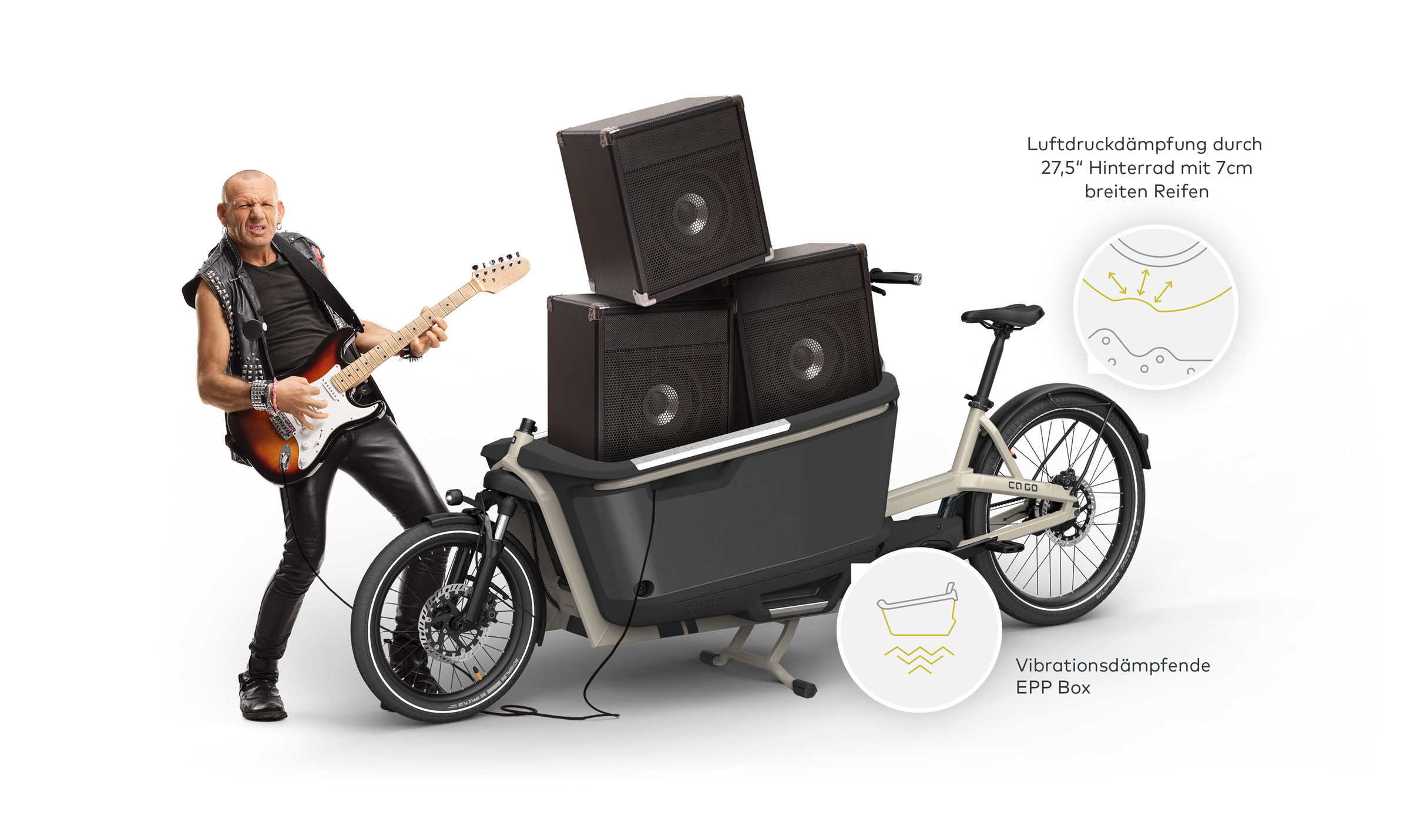
CA GO needed to establish trust in a market where safety had rarely been communicated. Instead of using fear or instruction, the strategy combined humor and seriousness to make safety visible, understandable, and memorable.
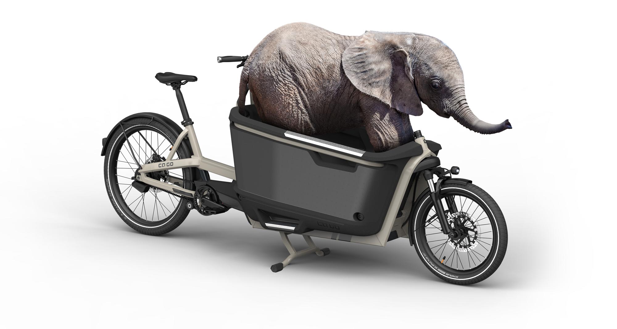
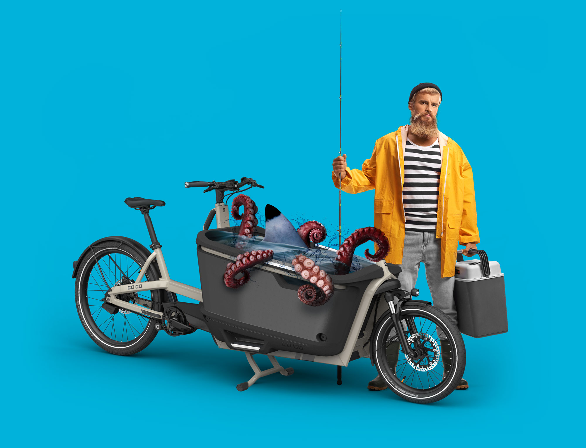
Playful visual metaphors — such as a baby elephant or an oversized crash‑test egg inside the cargo box — were used as conversation starters. Behind the humor, clear facts and explanations delivered credibility and confidence.
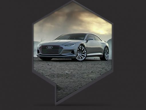
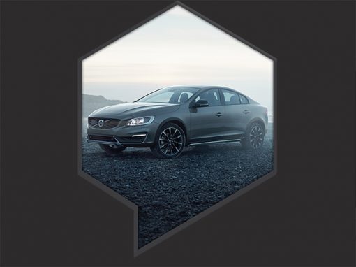
The brand was positioned on a premium automotive level, comparable to brands like Audi or Volvo: modern, calm, and precise — never loud, never ironic.
Agency: Freelance in Cooperation with KMS
Client: Ca Go (powered by RTI Sports)
My role:
– Freelance Creative Director,
– Freelance Art Director,
– Freelance UX&UI Designer
– Freelance Illustrator
01.
Corporate Design & System
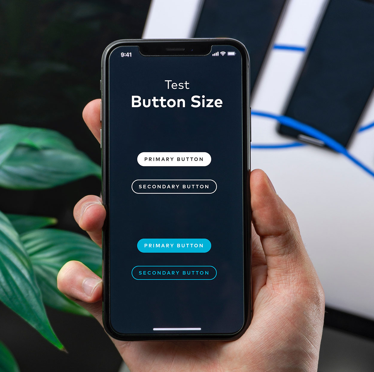
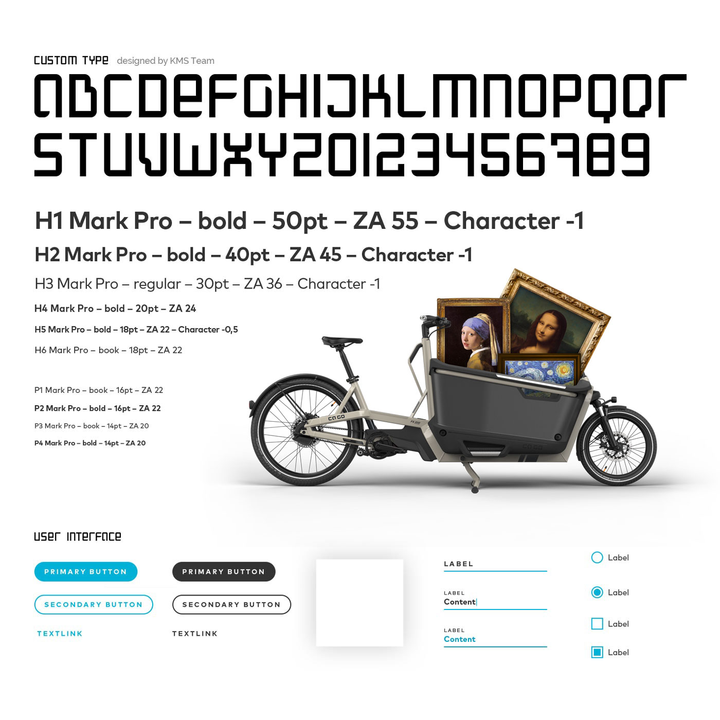
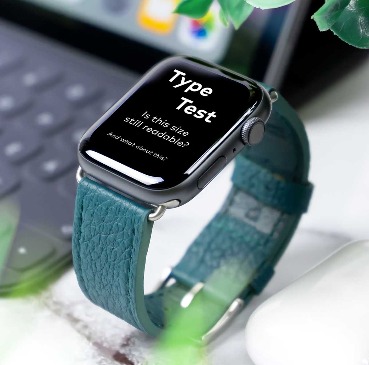
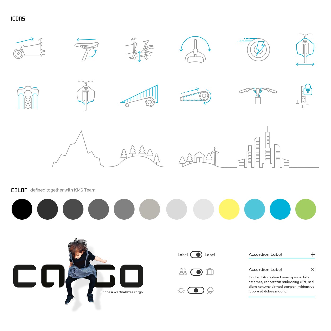
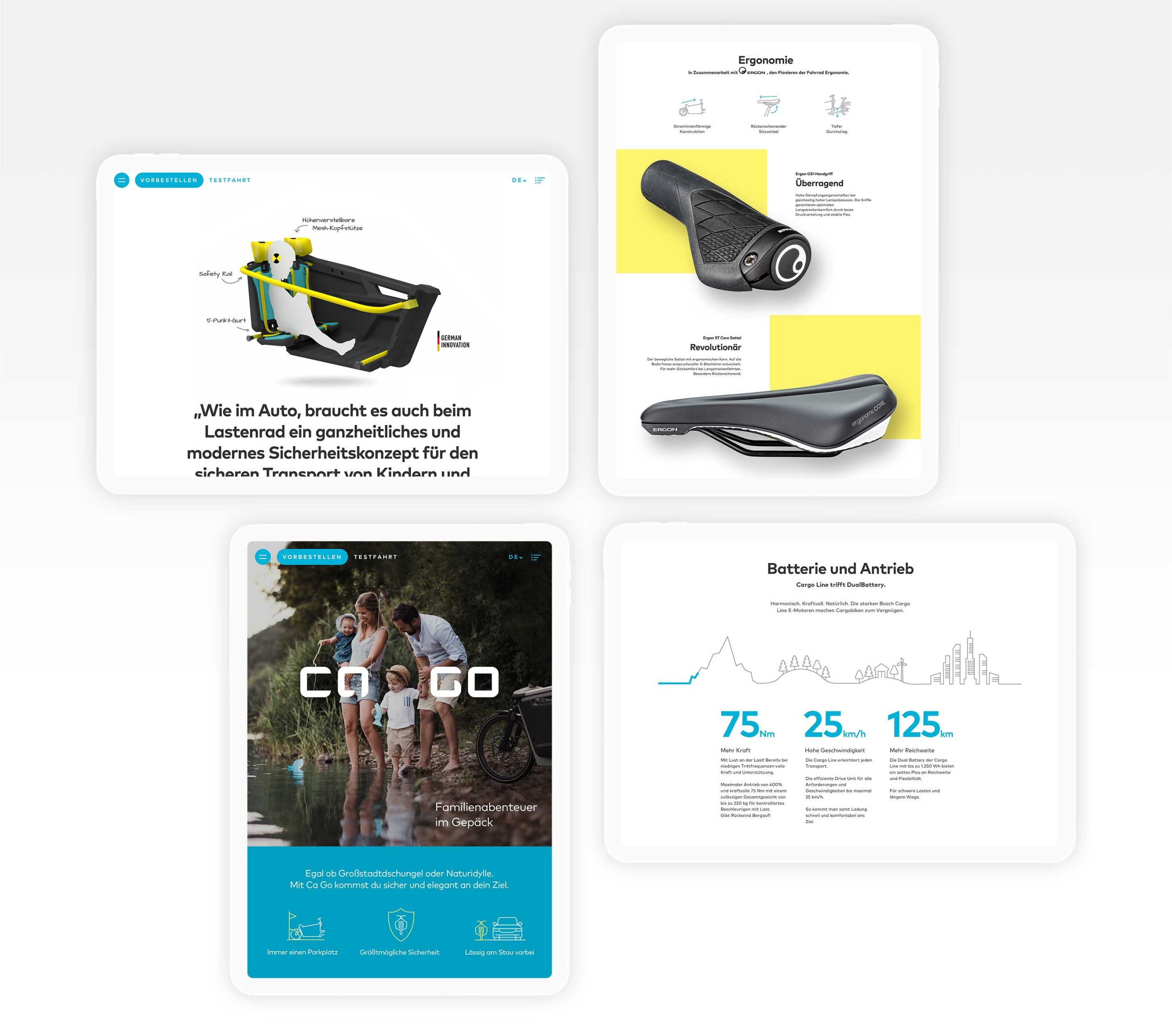
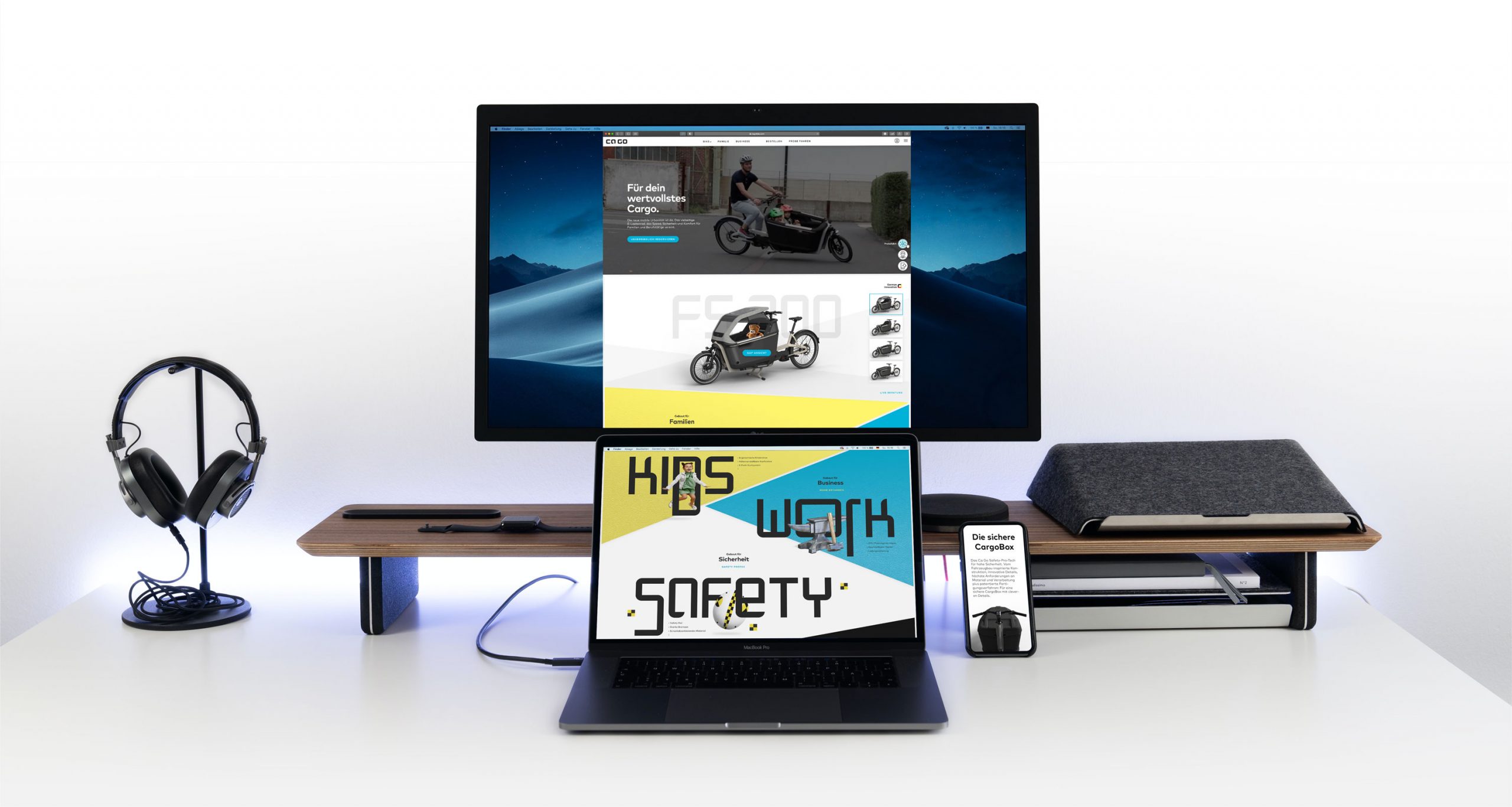
The visual identity is reduced, modern, and functional. A custom typeface (developed by KMS) and bespoke icon set create a distinctive but controlled character. Despite the typeface’s complexity, careful layout and hierarchy ensured clarity and usability.
02.
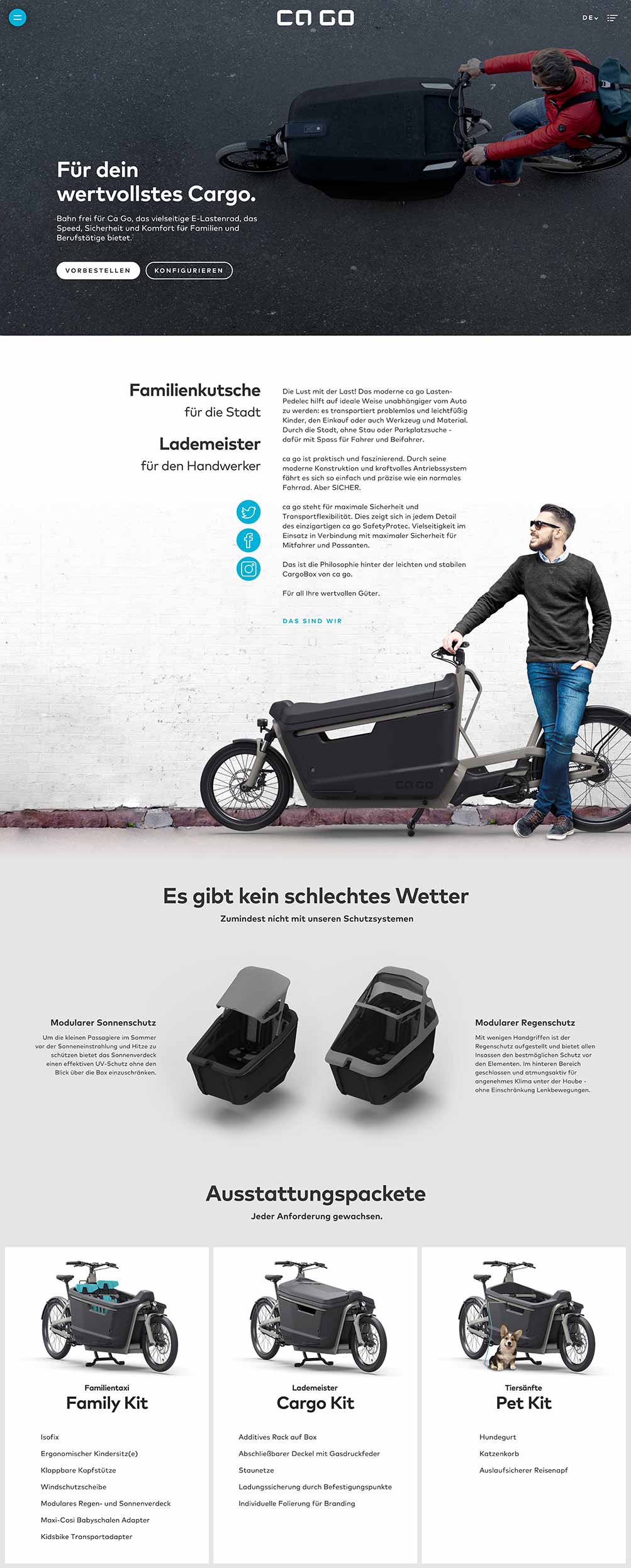
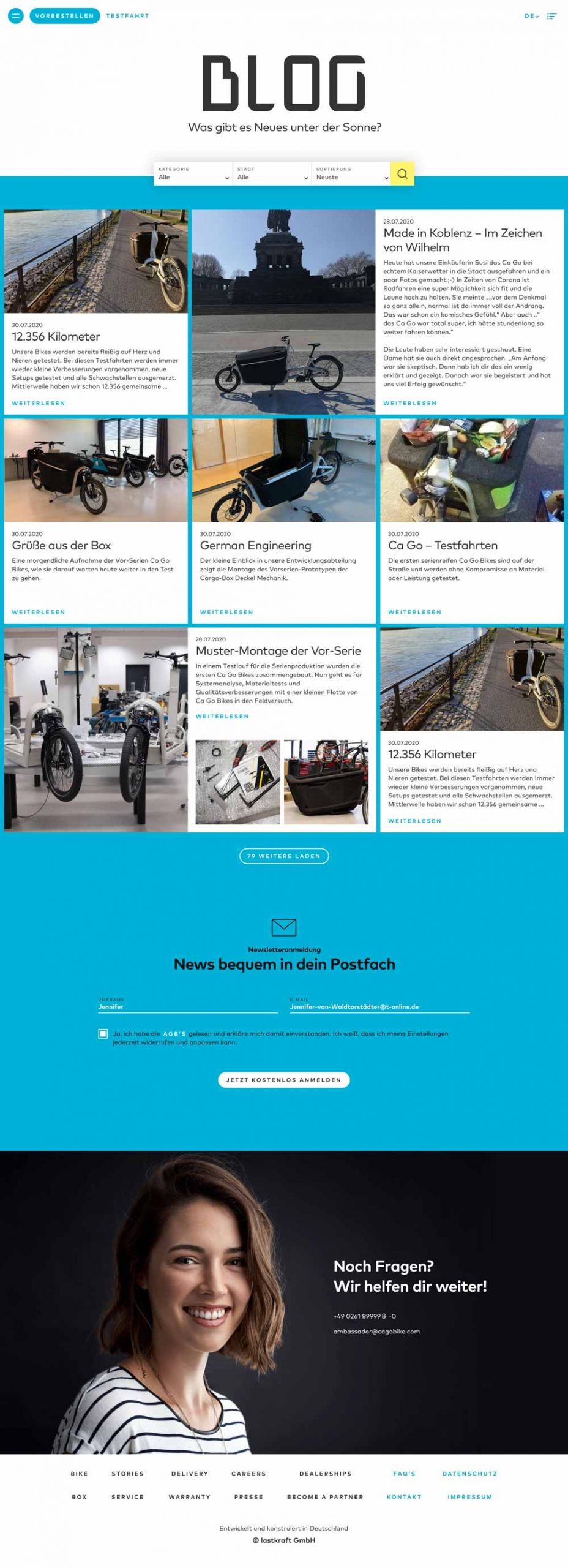
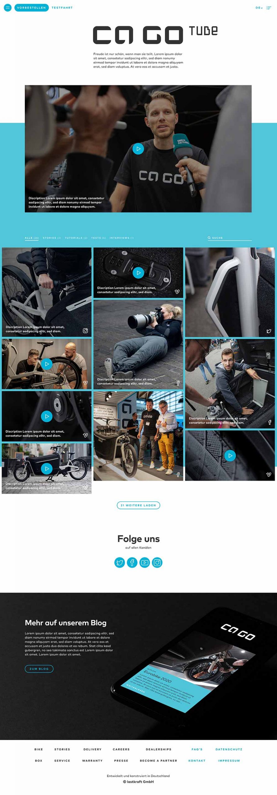
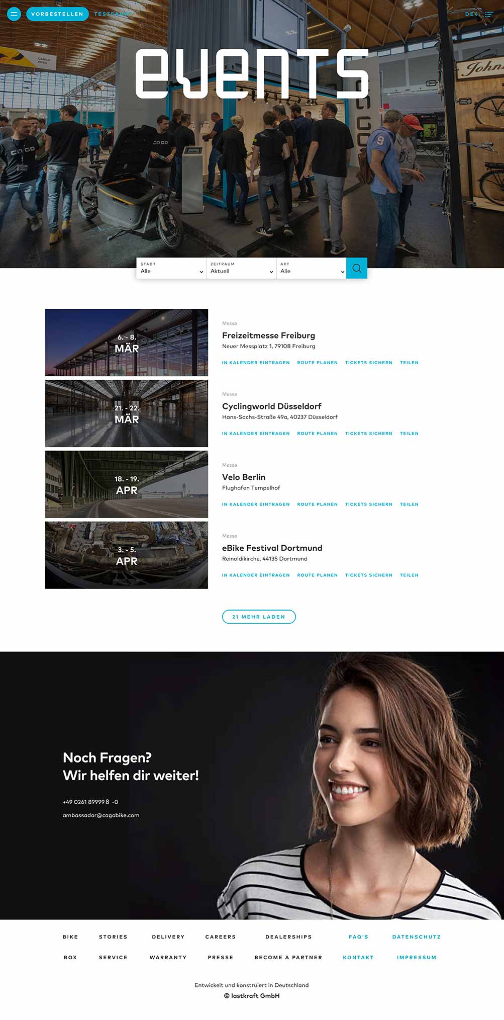
Webdesign
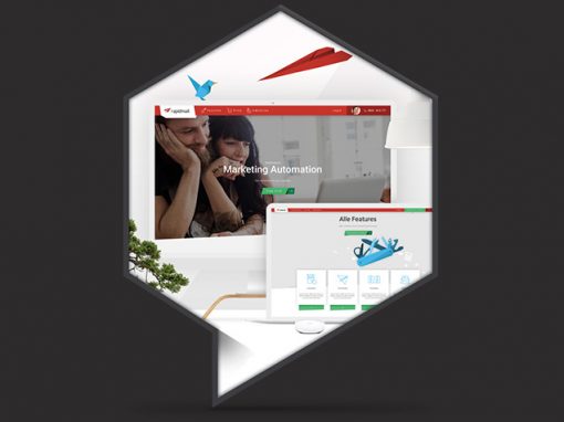
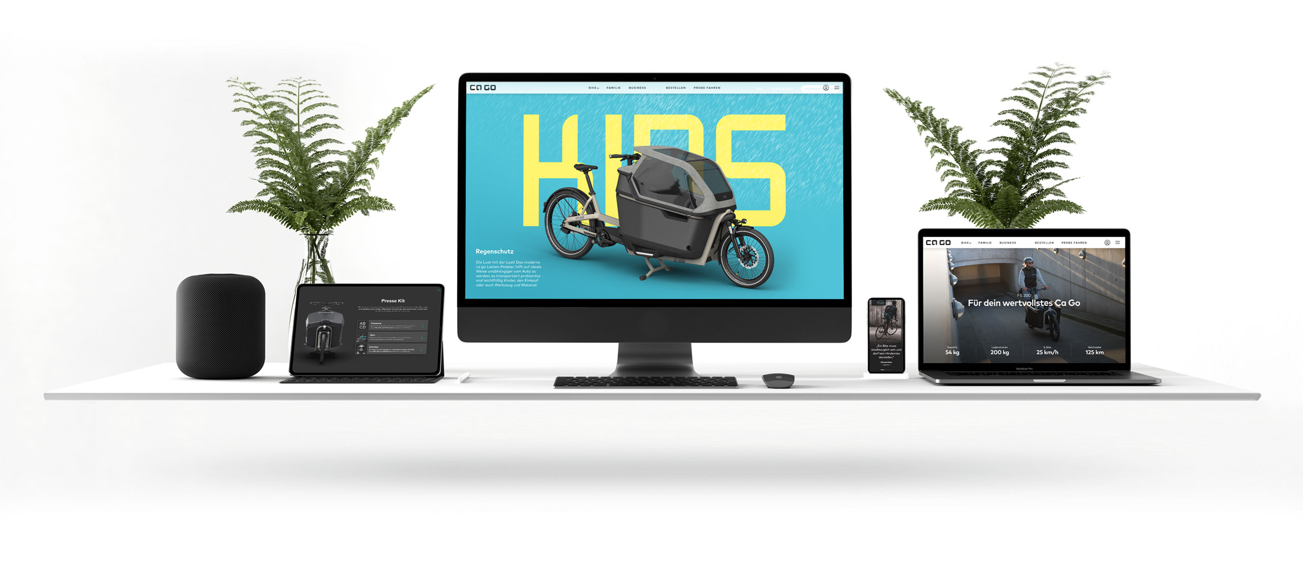
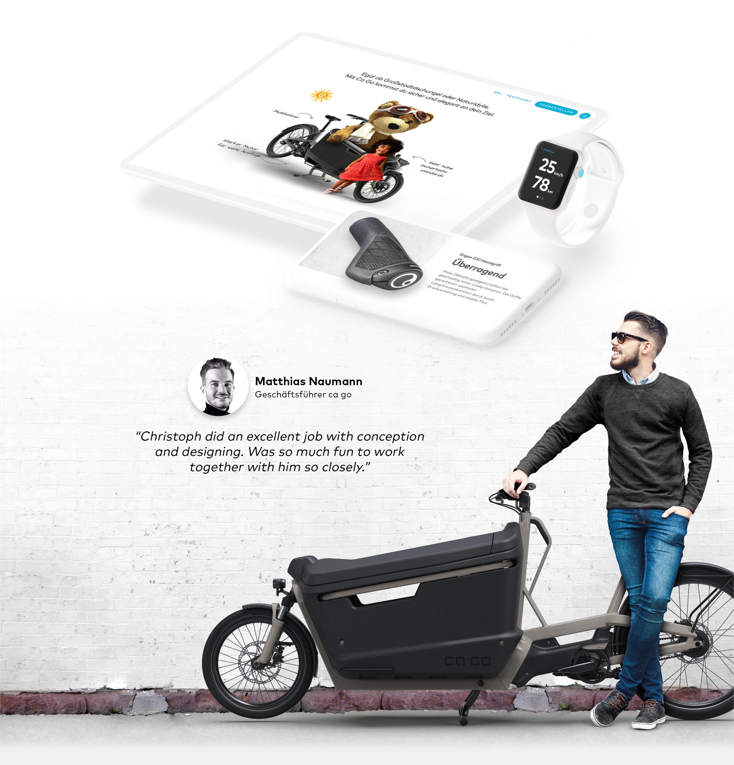
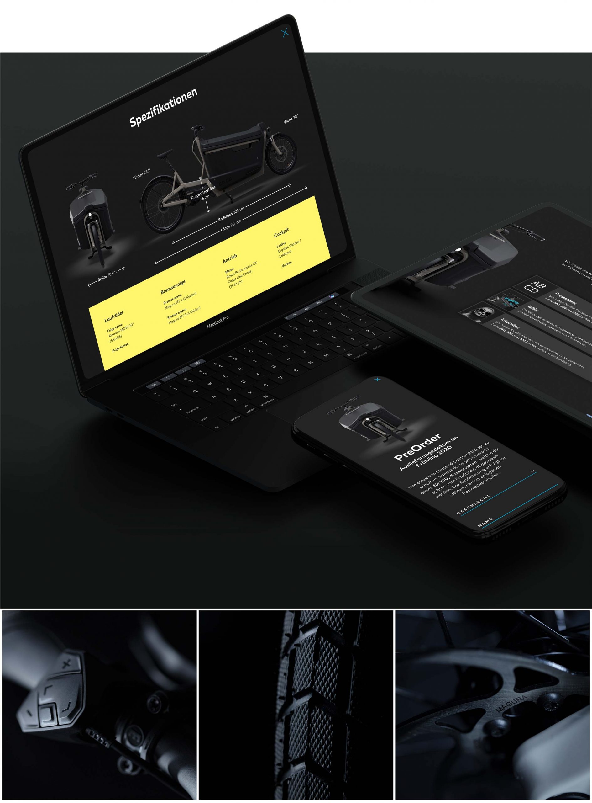
The website was designed as a scalable system from the start. Its structure allowed later additions such as a configurator and shop without changing navigation or core UX — reflecting the long‑term thinking behind the product itself.
Because no official photoshoot existed at launch, realistic 3D renderings and retouched visuals were used. The focus was authenticity over perfection, ensuring the product felt tangible and trustworthy.
03.
Configurator
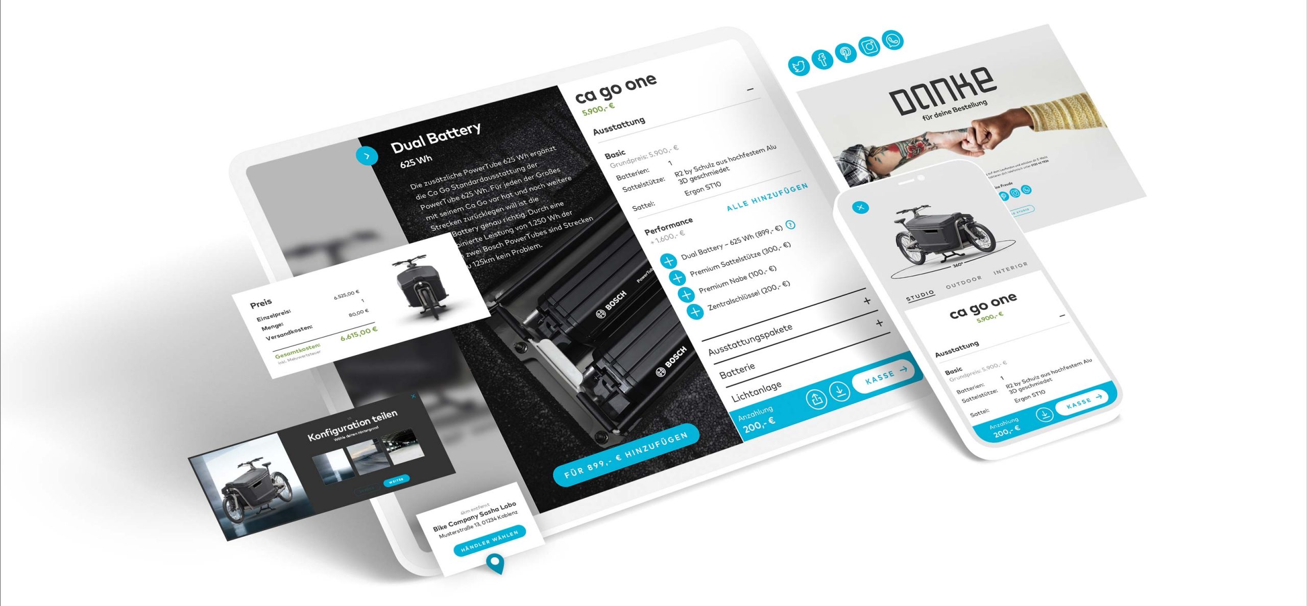
The configurator was conceived as an integral part of the brand experience — not as a separate tool. It translates the product’s technical depth into a clear, intuitive flow that feels calm, reliable, and premium.
Users can configure their CA GO step by step without friction or overload. Each decision is clearly explained, visually supported, and embedded into the overall design language. This reinforces trust and mirrors the mindset of high-end automotive configurators, where complexity is hidden behind clarity.
The configurator was added later without restructuring the website — a direct result of the scalable system architecture defined from the beginning.
04.
App Concept
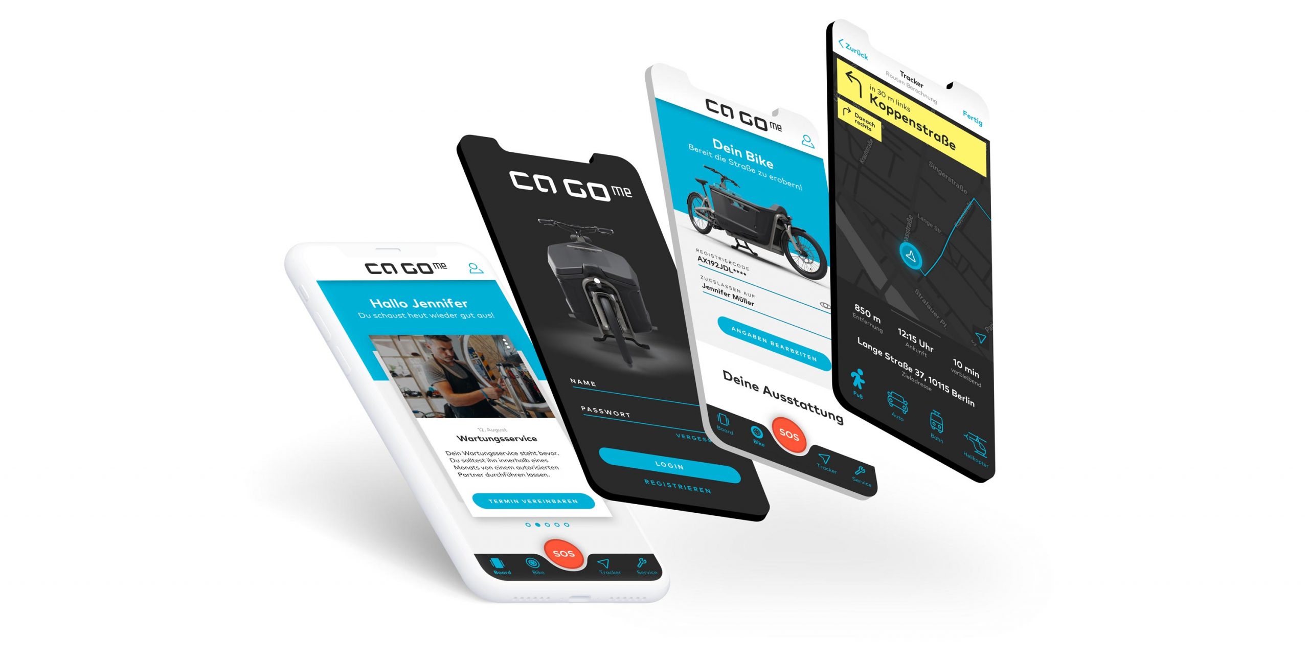
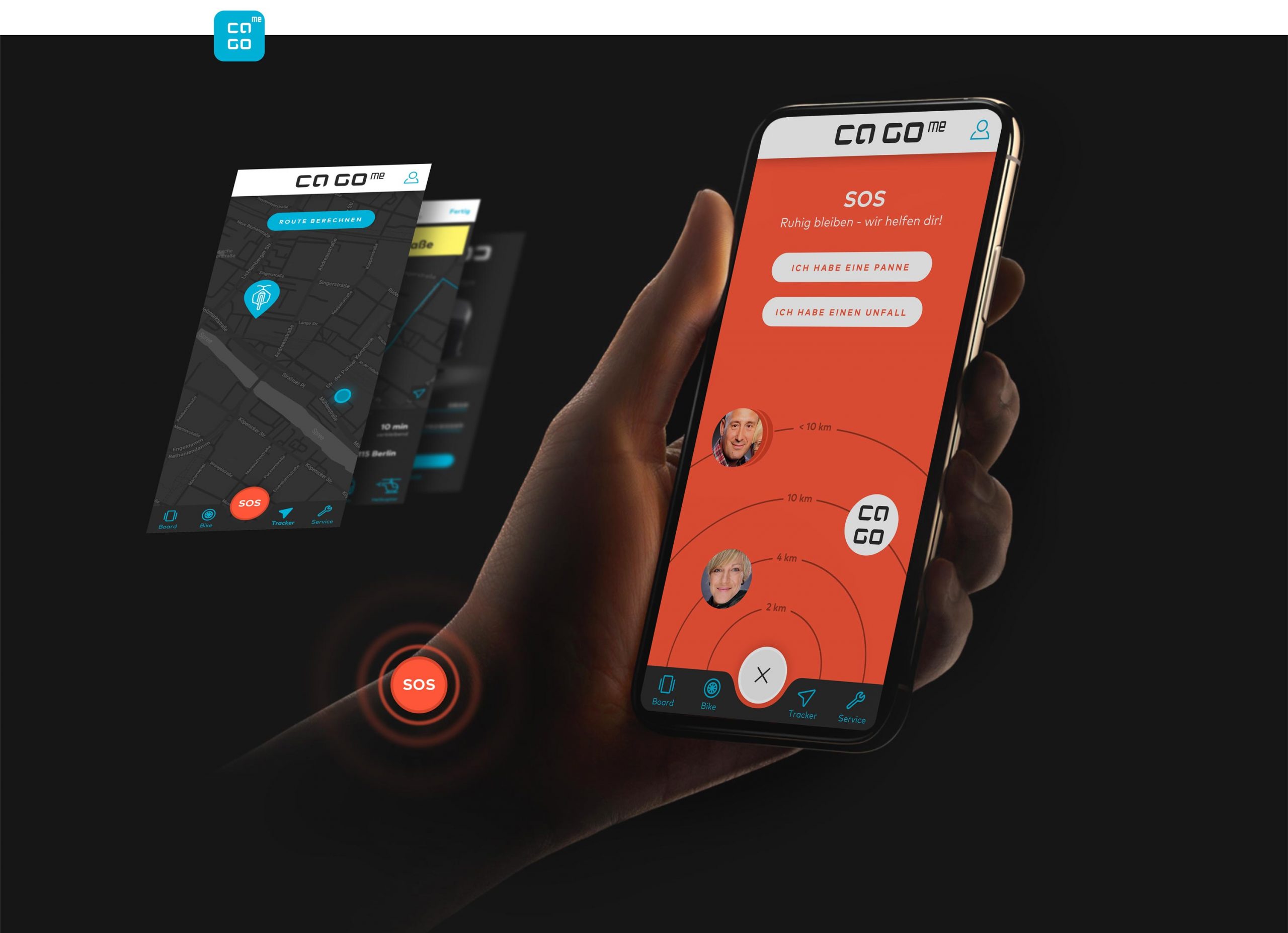
The CA GO app was developed as a conceptual extension of the product ecosystem. While not yet released, it plays a crucial role in the brand’s safety narrative. At the center of the interface sits a bold red SOS button — deliberately visible and always accessible. It acts as a visual anchor and a clear promise: help is one tap away.
Beyond its functional meaning, the SOS button reinforces CA GO’s core story of safety and responsibility. It translates an abstract value into a tangible interaction and turns trust into something users can literally touch.
The app concept is reduced, focused, and calm — designed to support the rider in critical moments rather than distract them. It extends the premium, automotive-inspired mindset into the digital space and underlines CA GO’s commitment to protecting what matters most.
05.
Print & Physical Touchpoints
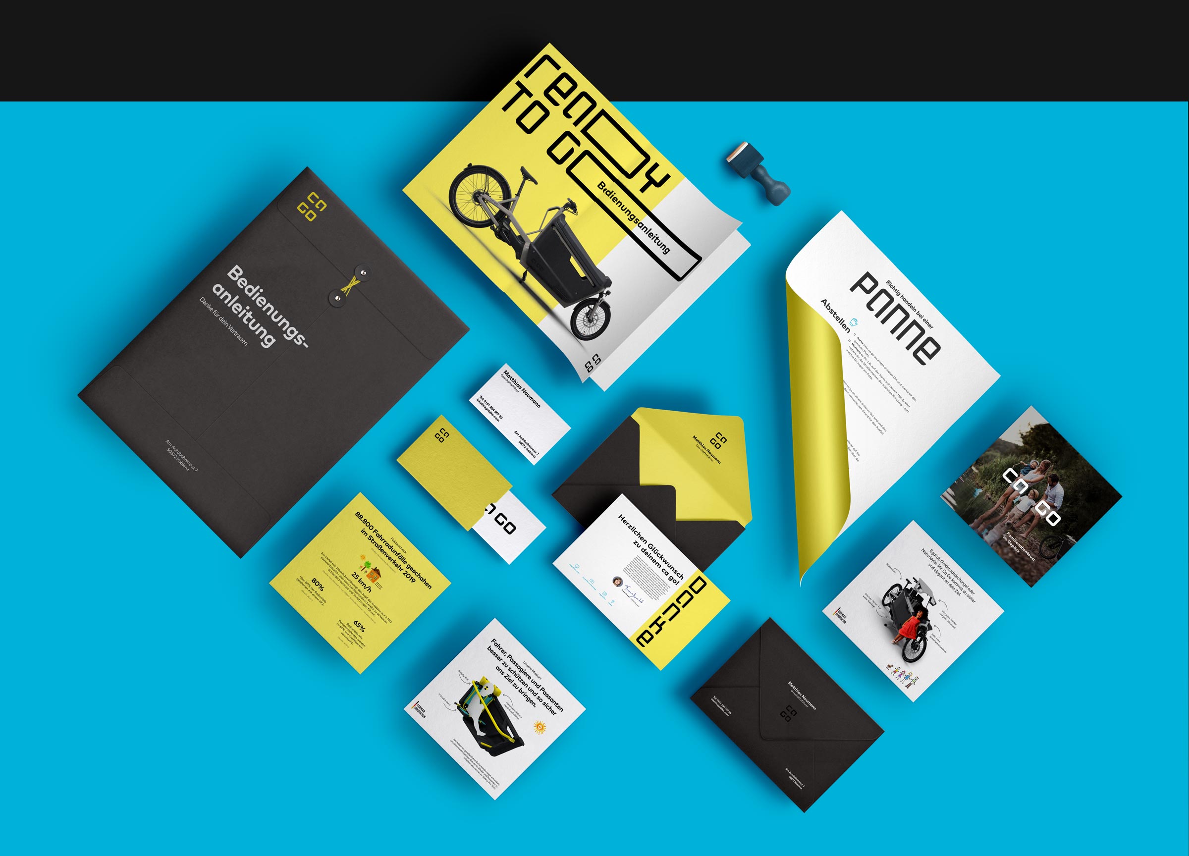
Print media played an essential role in bringing the brand into the physical world. From the very first interaction, every printed piece needed to communicate clarity, confidence, and trust.
Materials such as the user manual, roadside assistance information, direct mailings, stationery, and flyers were designed with the same reduced and premium mindset as the digital experience. Complex information was translated into clear structures, calm layouts, and a consistent visual language.
Especially in moments where reliability matters — such as breakdown situations or first-time product use — print becomes a critical interface. These touchpoints reinforce the feeling that CA GO is thoughtfully designed, dependable, and prepared for real life.
Collaboration & Result
The collaboration was close and direct, with short decision paths and shared responsibility — often working side by side with the CEO. This allowed brand, product, and communication to evolve together.
CA GO successfully redefined safety as a core value in the cargo bike category, justified its premium positioning, and introduced a new, confident narrative for modern urban mobility.
Agency
Freelance in cooperation with KMS Team
Client
ca go (a RTI brand)
Concepter
Christoph Gey
Matthias Naumann
Freelance Art & Creative Director
Christoph Gey
Freelance User Interface & User Experience
Christoph Gey



Let's create something meaningful together
I love what I do - for me, design is less of a job and more of a calling. That's why I enjoy working with ambitious individuals and mid-sized businesses just as much as I do with global players. If you bring that same passion to your project, I’d love to hear from you. Let’s find out together how we can take your vision to the next level.
